> For the complete documentation index, see [llms.txt](https://docs.apryse.com/llms.txt). Markdown versions of documentation pages are available by appending `.md` to page URLs; this page is available as [Markdown](https://docs.apryse.com/core/create/document-creation-api/chart-definition-json.md).
# Chart definition JSON
Use the document creation API to use the Chart definition JSON to create charts in docs programmatically.
The `Chart` content element is configured entirely from a single JSON string. That string is accepted by:
* `AddChart(width, height, definition)` : Creates a chart from a definition.
* `SetDefinition(definition)` : Replaces the definition of an existing chart.
{% hint style="info" %}
**Info**
`SetDefinition` replaces the chart entirely. Any previously applied definition and derived styling is discarded. The chart width and height are **not** part of the definition and are preserved.
{% endhint %}
See [Charts](/core/create/document-creation-api/charts.md) for the API that hosts these definitions.
## Chart definition JSON example
{% tabs %}
{% tab title="JSON" %}
{% code lineNumbers="true" %}
```json
{
"chartType": "bar",
"title": "Revenue by region (thousands CAD)",
"theme": "nature",
"data": {
"categories": { "data": ["Q1", "Q2", "Q3", "Q4"] },
"series": [
{ "name": { "data": ["North America"] }, "data": { "data": [1250, 1410, 1580, 1720] } },
{ "name": { "data": ["Europe"] }, "data": { "data": [910, 980, 1120, 1180] } },
{ "name": { "data": ["Asia Pacific"] }, "data": { "data": [640, 720, 905, 1010] } }
]
}
}
```
{% endcode %}
{% endtab %}
{% endtabs %}
## Definition structure
The definition is a JSON object. All members are optional; anything omitted keeps its default.
| Member | Type | Description |
| ----------- | ------ | ------------------------------------------------------------------------------- |
| `chartType` | string | Chart family. One of `bar`, `pie`, `radar`. Case insensitive. Default is `bar`. |
| `title` | string | Chart title, rendered above the plot area. |
| `theme` | string | Named color palette applied to the series. See [Themes](#themes). |
| `data` | object | Categories and data series. See [Data](#data). |
### Value ranges
Most leaf values in a chart definition are not plain arrays, but range objects. A range object carries the literal values and, optionally, a spreadsheet-style reference.
| Member | Type | Description |
| ------ | ------ | ----------------------------------------------------------------------------------------------------------------------------- |
| `data` | array | The literal values. |
| `ref` | string | Optional source range reference, retained as metadata so the chart can be re-linked to a spreadsheet. Ignored when rendering. |
```json
{ "data": [1250, 1410, 1580], "ref": "Sheet1!$B$2:$D$2" }
```
This wrapper is used for `categories`, series `name`, `data`, `dataDomain`, `markerSize`, and `labels`.
## Data
The `data` object holds the category axis values and the list of series.
| Member | Type | Description |
| ------------ | ---------------- | --------------------------------------------------- |
| `categories` | range of strings | Labels for the category axis, shared by all series. |
| `series` | array of objects | One entry per data series. See [Series](#series). |
### Series
Each element of `series` is an object.
| Member | Type | Description |
| ----------------- | ---------------- | --------------------------------------------------------------------------------- |
| `name` | range of strings | The series name, taken from the first array element. Used in the legend. |
| `data` | range of numbers | The series values, one per category. |
| `dataDomain` | range of numbers | Explicit X values, for scatter-style data where categories are not evenly spaced. |
| `markerSize` | range of numbers | Per-point marker sizes, producing a bubble-style rendering. |
| `labels` | range of strings | Explicit per-point data labels, overriding the formatted values. |
| `showLabels` | bool | Show data labels for every point of the series. |
| `line` | bool | Render the series as a line instead of columns. Radar series are always lines. |
| `trendlineType` | string | Adds a trendline. See [Trendlines](#trendlines). Bar/Column series only. |
| `showTrendlineEq` | bool | Display the fitted equation next to the trendline. |
Series are matched to the existing chart series by their index in the array, which makes it possible to update only the data of an already configured chart.
## Chart types
Chart types include:
* Bar
* Pie
* Radar
### Bar
The default family: a clustered column chart with a category axis and a value axis, gridlines, and a legend at the bottom. Individual series can be switched to lines with `"line": true`, which lets you mix columns and lines in one chart.
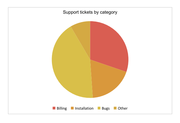
### Pie
A single-series proportional chart. When the definition creates more than one series, a doughnut hole is applied automatically.
{% tabs %}
{% tab title="JSON" %}
{% code lineNumbers="true" %}
```json
{
"chartType": "pie",
"title": "Support tickets by category",
"theme": "sunset",
"data": {
"categories": { "data": ["Billing", "Installation", "Bugs", "Other"] },
"series": [
{ "name": { "data": ["Tickets"] }, "data": { "data": [340, 210, 480, 95] } }
]
}
}
```
{% endcode %}
{% endtab %}
{% endtabs %}
### Radar
A polar chart where every category is an axis radiating from the center. Radar series are always rendered as lines, which makes this type well suited to scorecards and comparisons across several dimensions.
{% tabs %}
{% tab title="JSON" %}
{% code lineNumbers="true" %}
```json
{
"chartType": "radar",
"title": "Product scorecard",
"theme": "vivid",
"data": {
"categories": { "data": ["Speed", "Quality", "Price", "Support", "Docs"] },
"series": [
{ "name": { "data": ["Current"] }, "data": { "data": [8, 9, 6, 7, 8] } },
{ "name": { "data": ["Previous"] }, "data": { "data": [6, 7, 7, 5, 6] } }
]
}
}
```
{% endcode %}
{% endtab %}
{% endtabs %}
## Themes
`theme` selects a palette that is applied to the series in order, cycling through eight colors. Values are case insensitive.
| Theme | Palette |
| ----------- | --------------------------------------------- |
| `pastel` | Soft pinks, peaches, mints and lavenders. |
| `grayscale` | Neutral grays, from near-black to near-white. |
| `vivid` | Saturated spectrum colors. |
| `nature` | Greens, olives and khakis. |
| `sunset` | Corals, ambers and deep purples. |
If `theme` is omitted, the default series palette is used. Fill colors of column and pie series are applied with slight transparency, while line series use the palette color at full opacity.
## Trendlines
Setting `trendlineType` on a bar/column series fits a curve through the data and draws it as a dashed line in a translucent variant of the series color. The trendline is named `" (Trend)"` in the legend.
| Value | Fit |
| ----------- | --------------------------- |
| `Exp` | Exponential |
| `Linear` | Least-squares straight line |
| `Log` | Logarithmic |
| `MovingAvg` | Moving average |
| `Poly` | Polynomial |
| `Power` | Power law |
Values are matched case insensitively. Set `"showTrendlineEq": true` to print the fitted equation on the chart.
{% tabs %}
{% tab title="JSON" %}
{% code lineNumbers="true" %}
```json
{
"chartType": "bar",
"title": "Monthly active users",
"theme": "pastel",
"data": {
"categories": { "data": ["Jan", "Feb", "Mar", "Apr", "May", "Jun"] },
"series": [
{
"name": { "data": ["Users"] },
"data": { "data": [120, 160, 150, 210, 260, 290] },
"line": true,
"showLabels": true,
"trendlineType": "Linear",
"showTrendlineEq": true
}
]
}
}
```
{% endcode %}
{% endtab %}
{% endtabs %}
## Using a definition from code
A complete definition is just a JSON object, so build it with your JSON library of choice and pass the serialized result to the chart API.
```json
{
"chartType": "pie",
"title": "Support tickets by category",
"theme": "sunset",
"data": {
"categories": { "data": ["Billing", "Installation", "Bugs", "Other"] },
"series": [
{ "name": { "data": ["Tickets"] }, "data": { "data": [340, 210, 480, 95] } }
]
}
}
```
See [Charts](/core/create/document-creation-api/charts.md) for the code that adds a chart in each supported language, along with sizing and replacement semantics.
## Notes and troubleshooting
* **The definition must be a JSON object.** A definition that is not a JSON object, or that is malformed, raises an exception.
* **Unknown members are ignored,** so definitions can carry extra metadata safely.
* **Series values should align with categories.** A series with fewer values than categories simply leaves the remaining categories empty.
* **Chart size lives in the API, not the JSON.** Use `AddChart(width, height, ...)` or `SetWidth` and `SetHeight`.
* **Sizes are in points** (1/72 inch), consistent with the rest of the document creation API.
## Further Reading
[Charts](/core/create/document-creation-api/charts.md) for the `Chart` API that hosts these definitions.
---
# Agent Instructions
This documentation is published with GitBook. GitBook is the documentation platform designed so that both humans and AI agents can read, navigate, and reason over technical content effectively. Learn more at gitbook.com.
## Querying This Documentation
If you need additional information that is not directly available in this page, you can query the documentation dynamically by asking a question.
Perform an HTTP GET request on the current page URL with the `ask` query parameter, and the optional `goal` query parameter:
```
GET https://docs.apryse.com/core/create/document-creation-api/chart-definition-json.md?ask=&goal=
```
`ask` is the immediate question: it should be specific, self-contained, and written in natural language.
`goal` is optional and describes the broader end goal you are ultimately trying to accomplish on behalf of the user. GitBook uses it to tailor the answer towards what is most useful for that goal.
The response will contain a direct answer to the question and relevant excerpts and sources from the documentation.
Use this mechanism when the answer is not explicitly present in the current page, you need clarification or additional context, or you want to retrieve related documentation sections.