> For the complete documentation index, see [llms.txt](https://docs.apryse.com/llms.txt). Markdown versions of documentation pages are available by appending `.md` to page URLs; this page is available as [Markdown](https://docs.apryse.com/web/ui-customization/modular-ui/panels.md).
# Integrate Modular UI Panels in WebViewer
Enhance user interaction with modular panels in WebViewer! Learn how to seamlessly integrate prebuilt and custom panels into your UI for a dynamic user experience. Explore detailed instructions and ex
Modular panels serve as dynamic components within WebViewer, designed to enhance user interaction by displaying content either on the left or right side. This guide provides detailed instructions and examples for incorporating both prebuilt and custom panels into your UI, offering a seamless integration process.
## Prebuilt Panels
The UI includes a comprehensive selection of preconfigured panels designed to address common functionality requirements, such as thumbnail manipulation and document outline navigation. Through the use of the provided APIs, you can seamlessly integrate these panels into your UI. Additionally, you have the flexibility to customize various aspects of their behavior, such as the side of the UI from which they open.
### List of Prebuilt Panels
* Outline
* Signature
* Bookmarks
* File Attachment
* Thumbnail
* Layers
* Text Editing
* Change List
* Style
* Redaction
* Search
* Notes
* Tabs
* Signature List
* Rubber Stamp
* Portfolio
### Integrating Prebuilt Panels
To incorporate a prebuilt panel, utilize the `addPanel` API, specifying necessary properties such as `dataElement`, `location`, `label`, and `render`. For prebuilt panels, `render` corresponds to a reserved identifier, while for custom panels, it involves a function returning the panel element.
{% hint style="info" %}
**Prebuilt Panels Enum**
The namespace with all the identifiers for the prebuilt panels can be found at [instance.UI.Panels](https://sdk.apryse.com/api/web/UI.html#.Panels__anchor)
{% endhint %}
{% tabs %}
{% tab title="JavaScript" %}
{% code lineNumbers="true" %}
```js
// Bookmark Panel
instance.UI.addPanel({
dataElement: 'bookmarkPanel',
location: 'left',
render: instance.UI.Panels.BOOKMARKS,
});
// Thumbnail Panel
instance.UI.addPanel({
dataElement: 'thumbnailPanel',
location: 'right',
render: instance.UI.Panels.THUMBNAIL,
});
```
{% endcode %}
{% endtab %}
{% endtabs %}
[UI.addPanel](https://sdk.apryse.com/api/web/UI.html#.addPanel)
Visual representation of the panels:

Bookmarks Panel

Thumbnails Panel
To open the panels, you can use the API [openElements](https://sdk.apryse.com/api/web/UI.html#.openElements__anchor) with the dataElement of the panel. You can also add a [toggle button](/web/ui-customization/modular-ui/items.md#toggle-element-buttons) to your UI and use the selector of the panel as the `toggleElement` of the button.
{% tabs %}
{% tab title="JavaScript" %}
{% code lineNumbers="true" %}
```js
// Using the openElements API to open the Bookmark panel
instance.UI.openElements(['bookmarkPanel']);
// Using the toggle button to open the Thumbnail panel
const thumbnailPanelToggle = new instance.UI.Components.ToggleElementButton({
dataElement: 'thumbnailPanelToggle',
toggleElement: 'thumbnailPanel',
img: 'icon-header-sidebar-line',
title: 'Thumbnail Toggle Panel',
});
// Then this button should be added to a container's item using the setItems API.
// This container can be a modular header or a grouped items container.
const defaultHeader = instance.UI.getModularHeader('default-top-header')
defaultHeader.setItems([thumbnailPanelToggle]);
```
{% endcode %}
{% endtab %}
{% endtabs %}
[UI.Components.ToggleElementButton](https://sdk.apryse.com/api/web/UI.Components.ToggleElementButton.html) [UI.getModularHeader](https://sdk.apryse.com/api/web/UI.html#.getModularHeader) [setItems for Modular Headers](https://sdk.apryse.com/api/web/UI.Components.ModularHeader.html#setStyle) [setItems for Grouped Items](https://sdk.apryse.com/api/web/UI.Components.GroupedItems.html#setGrow)
## Adding Custom Panels
If you want to customize your UI even more, the Modular UI framework lets you build panels exactly the way you want. This means you can create special components that fit perfectly with what your app needs. You still use the same properties when creating panels with the prebuilt options. However, instead of passing a panel element identifier directly to the `render` property, you pass a function that returns the panel element. This element can be a React component or a DOM element built with JavaScript, giving you the flexibility to tailor your UI components to your specific requirements.
{% tabs %}
{% tab title="JavaScript" %}
{% code lineNumbers="true" %}
```js
// Adding a panel built with JS and DOM elements
instance.UI.addPanel({
dataElement: 'customPanel',
location: 'left',
icon: '/path/to/icon.svg',
render: () => {
const div = document.createElement('div');
div.innerHTML = 'My custom panel';
return div;
}
});
// Adding a panel built with React
instance.UI.addPanel({
dataElement: 'customPanel',
location: 'right',
icon: '/path/to/icon.svg',
render: () =>
});
// You can then add a toggleElement button for this panel
// Using the toggle button to open the Thumbnail panel
const customPanelToggle = new instance.UI.Components.ToggleElementButton({
dataElement: 'customPanelToggle',
toggleElement: 'customPanel',
img: 'icon-header-sidebar-line',
title: 'Custom Panel',
});
// Then this button should be added to a container's item using the setItems API.
// This container can be a modular header or a grouped items container.
const defaultHeader = instance.UI.getModularHeader('default-top-header')
defaultHeader.setItems([customPanelToggle]);
```
{% endcode %}
{% endtab %}
{% endtabs %}
[UI.addPanel](https://sdk.apryse.com/api/web/UI.html#.addPanel) [UI.Components.ToggleElementButton](https://sdk.apryse.com/api/web/UI.Components.ToggleElementButton.html) [UI.getModularHeader](https://sdk.apryse.com/api/web/UI.html#.getModularHeader)
You can also add a custom panel to your UI by [importing it](/web/ui-customization/modular-ui/ui-import-and-export.md#panels) along with the other panels and elements using a JSON config file. In this case, the `render` property would need to refer to a function name which is included in a [function map](/web/ui-customization/modular-ui/ui-import-and-export.md#add-a-function-map).
## Tabbed Panels
To efficiently manage space and organize content, the framework supports tabbed panels, allowing multiple panels to be housed within a single container. The TabPanel component facilitates this, accepting properties like dataElement, location, and panelsList, which is an array detailing each panel within the tabs.
The Tabbed panel is built using the component `TabPanel` that receives an object with the following properties:
* **dataElement (string, required):** A unique string that identifies the panel;
* **location (string, 'left' or 'right', required):** The location to place the panel;
* **panelsList (Array):** An array of objects that represent the panels for the tabs. Each object should have the following properties:
* **dataElement (string, optional):** A unique string that identifies the inner panel.
* **icon (string, optional)**: Path to an image or base64 data. Can also be the filename of a .svg from the WebViewer icons folder found here: [assets/icons/](https://github.com/ApryseSDK/webviewer-ui/tree/master/assets/icons/) (i.e. `icon-save` to use `icon-save.svg`).
* **render (string | function, required):** When adding the prebuilt panels, it corresponds to the reserved identifier for the panels. For the custom panels, it is a function that returns the panel element.
You can have either prebuilt or custom panels added to your Tab Panel.
### Adding prebuilt panels to a tab panel
The following code snippet is adding only prebuilt panels to the tab panel.
{% tabs %}
{% tab title="JavaScript" %}
{% code lineNumbers="true" %}
```js
const tabPanel = new instance.UI.Components.TabPanel({
dataElement: 'myTabPanel',
panelsList: [
{
render: instance.UI.Panels.THUMBNAIL // or 'thumbnailsPanel'
},
{
render: instance.UI.Panels.OUTLINE // or 'genericOutlinesPanel'
},
{
render: instance.UI.Panels.BOOKMARKS // or 'bookmarkPanel'
},
{
render: instance.UI.Panels.LAYERS // or 'layersPanel'
},
{
render: instance.UI.Panels.FILE_ATTACHMENT // or 'fileAttachmentPanel'
},
],
location: 'right'
});
// Add the tab panel to the UI
instance.UI.addPanel(tabPanel);
// You can then add a toggleElement button for this panel
const tabPanelToggle = new instance.UI.Components.ToggleElementButton({
dataElement: 'tabPanelToggle',
toggleElement: 'myTabPanel',
img: 'icon-header-sidebar-line',
title: 'Tab Panel',
});
// Then this button should be added to a container's item using the setItems API.
// This container can be a modular header or a grouped items container.
const defaultHeader = instance.UI.getModularHeader('default-top-header')
defaultHeader.setItems([tabPanelToggle]);
```
{% endcode %}
{% endtab %}
{% endtabs %}
[UI.addPanel](https://sdk.apryse.com/api/web/UI.html#.addPanel) [UI.Components.ToggleElementButton](https://sdk.apryse.com/api/web/UI.Components.ToggleElementButton.html) [UI.getModularHeader](https://sdk.apryse.com/api/web/UI.html#.getModularHeader) [UI.Components.ModularHeader.setItems](https://sdk.apryse.com/api/web/UI.Components.ModularHeader.html#setItems)
This is the result:

### Adding custom panels to a tab panel
For custom panels within a TabPanel, the render property receives a function returning the panel element. This can be a React component or a DOM element built with JavaScript.
{% tabs %}
{% tab title="JavaScript" %}
{% code lineNumbers="true" %}
```js
const tabPanel = new instance.UI.Components.TabPanel({
dataElement: 'customLeftPanel',
panelsList: [
{
dataElement: 'firstPanel',
icon: '/path/to/icon.svg',
render: () => {
const panelDiv = document.createElement('div');
const paragraph = document.createElement('p');
paragraph.textContent = 'My panel';
const button = document.createElement('button');
button.textContent = 'Add';
button.style.backgroundColor = 'blue';
button.style.color = 'white';
panelDiv.appendChild(paragraph);
panelDiv.appendChild(button);
return panelDiv;
}
},
{
dataElement: 'secondPanel',
icon: '/path/to/icon.svg',
render: () =>
},
],
location: 'left'
});
```
{% endcode %}
{% endtab %}
{% endtabs %}
Another option for adding custom panels in the TabPanel is to first register the panel with the viewer using the `addPanel` API or [importing it](/web/ui-customization/modular-ui/ui-import-and-export.md#panels) with a config file and then using the panel's dataElement in the `panelsList` property.
{% hint style="info" %}
**Register custom panels before using them in a Tab Panel**
By registering the panel with the viewer, you can use the panel's dataElement in the panelsList property of the Tab Panel. Otherwise you will have to define the panel's render function directly in the panelsList property.
{% endhint %}
{% tabs %}
{% tab title="JavaScript" %}
{% code lineNumbers="true" %}
```js
instance.UI.addPanel({
dataElement: 'customPanel',
location: 'left',
icon: '/path/to/icon.svg',
render: () => {
const div = document.createElement('div');
div.innerHTML = 'My custom panel';
return div;
}
});
instance.UI.addPanel({
dataElement: 'customPanel2',
location: 'left',
icon: '/path/to/icon.svg',
render: () => {
const div = document.createElement('div');
div.innerHTML = 'My custom panel 2';
return div;
}
});
const tabPanel = new instance.UI.Components.TabPanel({
dataElement: 'TabPanel',
location: 'right',
panelsList: [
{
render: 'customPanel' // The dataElement can now be used as the panel is registered with the UI
},
{
render: 'customPanel2'
},
],
});
```
{% endcode %}
{% endtab %}
{% endtabs %}
[UI.addPanel](https://sdk.apryse.com/api/web/UI.html#.addPanel)
## Working with Panels
### addPanel
To incorporate panels into your UI, begin by registering them with the `addPanel` method. This step makes the panels ready for use within your interface. For detailed guidance on utilizing this method, including all available options, refer to the earlier sections of this documentation.
Example usage:
{% tabs %}
{% tab title="JavaScript" %}
{% code lineNumbers="true" %}
```js
instance.UI.addPanel({
dataElement: 'customPanel',
location: 'right',
icon: '/path/to/icon.svg',
render: () =>
});
```
{% endcode %}
{% endtab %}
{% endtabs %}
[UI.addPanel](https://sdk.apryse.com/api/web/UI.html#.addPanel__anchor)
### getPanels
This API fetches a comprehensive list of all the modular panels that can be utilized in the current UI. Once you have this list, you can select any specific panel and modify its properties using the APIs described below.
Example usage:
{% tabs %}
{% tab title="JavaScript" %}
{% code lineNumbers="true" %}
```js
const panelsList = instance.UI.getPanels();
```
{% endcode %}
{% endtab %}
{% endtabs %}
[UI.getPanels](https://sdk.apryse.com/api/web/UI.html#.getPanels)
### setPanels
If you want to modify the list of panels, you can make the changes in the list using JavaScript methods to modify arrays and then you should call the `setPanels` API with the modified list as a parameter to update the panels list.
Example usage:
{% tabs %}
{% tab title="JavaScript" %}
{% code lineNumbers="true" %}
```js
const panelsList = instance.UI.getPanels();
panelsList.pop();
instance.UI.setPanels(panelsList);
```
{% endcode %}
{% endtab %}
{% endtabs %}
[UI.setPanels](https://sdk.apryse.com/api/web/UI.html#.setPanels__anchor)
### delete
This API deletes a panel from the UI, rendering it inaccessible for future usage. The deleted panel will remain in the panels' list but it will not be rendered in the UI.
{% tabs %}
{% tab title="JavaScript" %}
{% code lineNumbers="true" %}
```js
const panelsList = instance.UI.getPanels();
// deleting the first panel from the UI
panelsList[0].delete();
```
{% endcode %}
{% endtab %}
{% endtabs %}
[UI.Panel.delete](https://sdk.apryse.com/api/web/UI.Components.Panel.html#delete)
### setLocation
This method allows you to change the location of a panel within the Modular UI. It receives a string indicating the new location where the panel should be positioned. The available values for the location property are `right` and `left`.
Example usage:
{% tabs %}
{% tab title="JavaScript" %}
{% code lineNumbers="true" %}
```js
const panelsList = instance.UI.getPanels();
// Find the panel you want to change the location of ie. searchPanel
const panel = panelsList.find(panel => panel.dataElement === 'searchPanel');
// setting its location to the left
panel.setLocation('left');
// You can also set the location via the property
panel.location = 'left';
```
{% endcode %}
{% endtab %}
{% endtabs %}
[UI.Panel.setLocation](https://sdk.apryse.com/api/web/UI.Components.Panel.html#setLocation)
### Changing items in a Tab Panel
To change the items in a Tab Panel, you can use the `UI.getPanels()` API to get the list of panels and then find the Tab Panel you want to modify. You can then use the `panelsList` property to modify the sub-panels in the Tab Panel.
{% tabs %}
{% tab title="JavaScript" %}
{% code lineNumbers="true" %}
```js
// Get the list of panels
const panels = instance.UI.getPanels();
// Find the Tab Panel you want to modify
const tabPanel = panels.find((panel) => panel.dataElement === 'customLeftPanel');
// create a new panel to add to the tab panel
const newPanel = { render: 'searchPanel', dataElement: 'searchPanel' };
// Add the new panel to the tab panel
const newTabPanels = tabPanel.panelsList;
newTabPanels.push(newPanel);
tabPanel.panelsList = newTabPanels;
```
{% endcode %}
{% endtab %}
{% endtabs %}
## Rendering a Panel in a Flyout
In WebViewer version 11.7+, the following panels can be rendered as items inside of [flyouts](/web/ui-customization/modular-ui/flyouts.md):
* `rubberStampPanel`
* `signatureListPanel`
* `stylePanel`
The panel to render is determined by the `render` property of the flyout item just like the one used to create a [prebuilt panel](#prebuilt-panels).
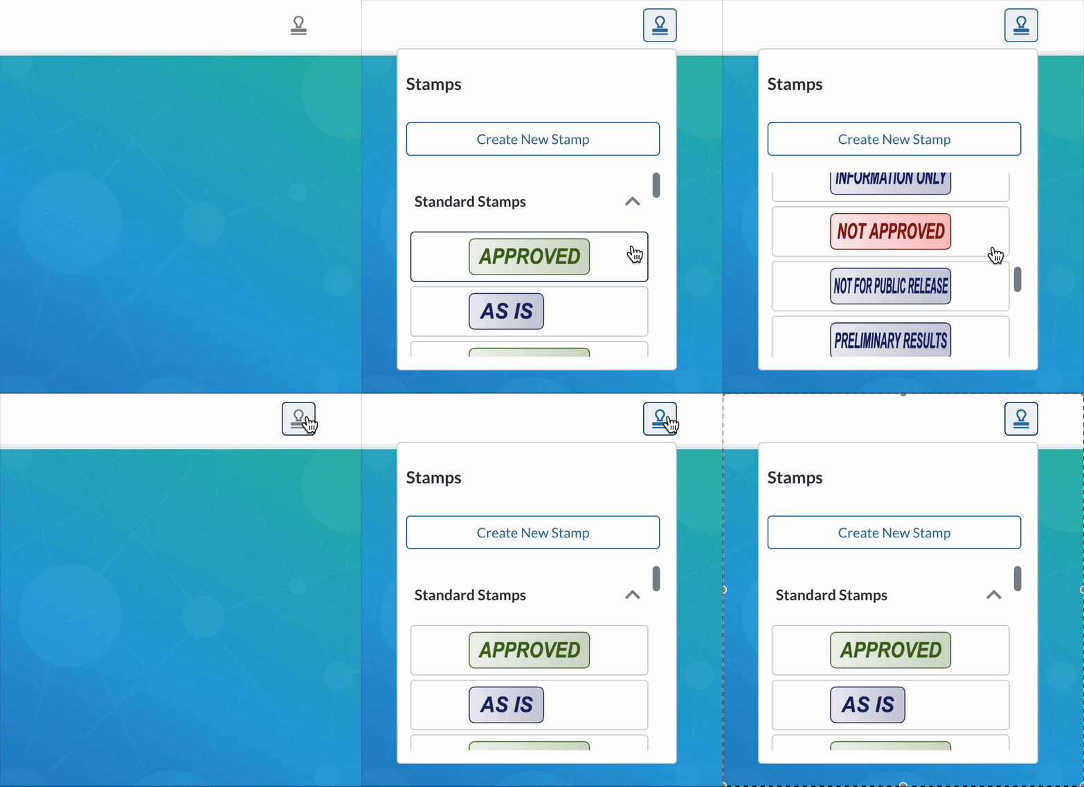
The example below shows the Rubber Stamp Panel being rendered inside of a flyout that is toggled by the Stamp Panel button.
### Using APIs
To add a panel to a flyout, first create a new flyout component with an item that includes a `render` property with a value that corresponds to the type of panel to be added. Then, add the flyout to the UI using the [addFlyouts](https://sdk.apryse.com/api/web/UI.Flyouts.html#.addFlyouts) function:
{% tabs %}
{% tab title="JavaScript" %}
{% code lineNumbers="true" %}
```js
// Create the flyout
const rubberStampFlyout = new instance.UI.Components.Flyout({
dataElement: 'rubberStampFlyout',
items: [{
dataElement: 'myRubberStampPanel',
render: 'rubberStampPanel'
}],
});
// Add the flyout to the UI
instance.UI.Flyouts.addFlyouts([rubberStampFlyout]);
```
{% endcode %}
{% endtab %}
{% endtabs %}
To open the flyout, add a toggle button to the UI that targets the flyout’s dataElement.
{% tabs %}
{% tab title="JavaScript" %}
{% code lineNumbers="true" %}
```js
// Create a toggle button to open the flyout
const rubberStampFlyoutToggle = new instance.UI.Components.ToggleElementButton({
dataElement: 'rubberStampFlyoutToggle',
title: 'Rubber Stamp',
img: 'icon-tool-stamp-line',
toggleElement: 'rubberStampFlyout'
});
// Add the toggle button to a header
const myHeader = instance.UI.getModularHeader('default-top-header');
myHeader.setItems([...myHeader.getItems(), rubberStampFlyoutToggle]);
```
{% endcode %}
{% endtab %}
{% endtabs %}
### Using a Config
The following example shows how to add a style panel to a flyout using a Modular UI [config](/web/ui-customization/modular-ui/ui-import-and-export.md#flyouts):
{% tabs %}
{% tab title="JavaScript" %}
{% code lineNumbers="true" %}
```js
{
"modularComponents": {
"rubberStampPanelFlyoutToggle": {
"dataElement": "rubberStampPanelFlyoutToggle",
"title": "Rubber Stamp Flyout",
"type": "toggleButton",
"img": "icon-tool-stamp-line",
"toggleElement": "rubberStampPanelFlyout"
}
},
"modularHeaders": {
"myHeader": {
"dataElement": "myHeader",
"justifyContent": "center",
"placement": "top",
"items": ["rubberStampPanelFlyoutToggle"]
}
},
"flyouts": {
"myFlyout": {
"dataElement": "rubberStampPanelFlyout",
"items": [
{
"dataElement": "myRubberStampPanel",
"render": "rubberStampPanel"
}
]
}
}
}
```
{% endcode %}
{% endtab %}
{% endtabs %}
For more information on how to add flyouts to the WebViewer UI, refer to the guide [here](/web/ui-customization/modular-ui/flyouts.md).
### Tool Buttons and Panel Flyouts
When you use a `ToolButton` (e.g., for signatures or rubber stamps) and the corresponding panel is configured as a flyout, clicking the tool button will open the flyout—not the standalone panel.
Example:
{% tabs %}
{% tab title="JavaScript" %}
{% code lineNumbers="true" %}
```js
const rubberStampFlyoutToggle = new instance.UI.Components.ToolButton({
dataElement: 'rubberStampToolButton',
type: 'toolButton',
toolName: 'AnnotationCreateRubberStamp',
});
```
{% endcode %}
{% endtab %}
{% endtabs %}
The tool button above will open the standalone panel by default if it exists. However, if a flyout containing the panel is present, the tool button will open the flyout instead. This prevents opening both the panel and the flyout at the same time.
---
# Agent Instructions
This documentation is published with GitBook. GitBook is the documentation platform designed so that both humans and AI agents can read, navigate, and reason over technical content effectively. Learn more at gitbook.com.
## Querying This Documentation
If you need additional information that is not directly available in this page, you can query the documentation by asking a question.
Perform an HTTP GET request on the following URL with the `ask` and `goal` query parameters:
```
GET https://docs.apryse.com/web/ui-customization/modular-ui/panels.md?ask=&goal=
```
`ask` is the immediate question: it should be specific, self-contained, and written in natural language.
`goal` is what the user is ultimately trying to achieve, the reason they need the answer. Sharing it helps GitBook give you a better, more relevant answer. A goal is most helpful when it describes the outcome the user wants rather than restating the question. For example, with `ask=how do I create an API token`, a goal like `automate deployments from our CI pipeline` lets GitBook tailor the answer to that use case.
The response will contain a direct answer to the question and relevant excerpts and sources from the documentation.
Use this mechanism when the answer is not explicitly present in the current page, you need clarification or additional context, or you want to retrieve related documentation sections.