Product:
Annotation toolbar customization in Xamarin
This tutorial only applies to Xamarin.Android. See Xamarin.iOS equivalent here .
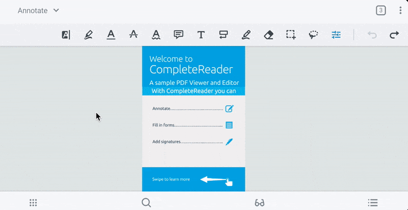
AnnotationToolbarComponent is a class that contains the logic and views that make up the annotation toolbar. The annotation toolbar can be customized to contain a number of annotation creation tools button as well as any custom button. With the annotation toolbar, users are able to conveniently create annotations and switch between different tools.
The buttons on the annotation toolbar are contained in two groups: the scrollable region (left) and the sticky region (right). The scrollable region can contain any number of buttons and scrolling is used to access buttons that are off-screen. Buttons in the sticky region will always show on the screen and will not be scrollable.
To learn more about each icon, see the icon cheat sheet .
Create a custom annotation toolbar
The annotation toolbar allows users to easily switch tools when adding annotations to a document. To add an annotation toolbar to your app, first define some layout groups in your app that will contain the annotation toolbar:
XML
Then in your activity, setup your AnnotationToolbarComponent with ToolManager and attach the required ViewModel classes:
C#
Finally, you can customize the annotation toolbar by either using one of our default toolbars or creating a custom toolbar from scratch.
C#
Show and hide annotation toolbar
You can show and hide the toolbar by calling AnnotationToolbarComponent.show(boolean) and AnnotationToolbarComponent.hide(boolean).
Hide annotation toolbar items
If you have used ToolManager to hide certain tools, then the associated tool buttons will also be hidden in the annotation toolbar.
Hide tool buttons
If there are tools that you would like to remove from the annotation toolbar, you can disable them by calling ToolManager.disableToolMode(ToolMode[]). This will also hide the tool in the quick menu. For example:
C#
For reference, a mapping of ToolMode to button icons is shown below:
Icon | ToolMode |
|---|---|
 |
|
 |
|
 |
|
 |
|
 |
|
 |
|
 |
|
 |
|
 |
|
 |
|
 |
|
 |
|
 |
|
 |
|
 |
|
 |
|
 |
|
 |
|
 |
|
 |
|
 |
|
 |
|
Annotation toolbar listener
You can set an AnnotationButtonClickListener to be notified of annotation toolbar button click events.
Edit annotations continuously
For continuous annotation creation, AnnotationToolbarComponent will use value set by PdfViewCtrlSettingsManager.setContinuousAnnotationEdit(Context, boolean) (by default true). If continuous annotation editing is disabled, then the tool button will be de-selected in the annotation toolbar after creating an annotation.
Appearance styles
In order to customize the appearance of UI elements in your annotation toolbar, you can define a new style that extends PTAnnotationToolbarTheme inside your res\values\style.xml file and pass it as an attribute to your viewer's theme named pt_annotation_toolbar_style. For more information on customizing the style of UI components, please take a look at our viewer theme guide .
Did you find this helpful?
Trial setup questions?
Ask experts on DiscordNeed other help?
Contact SupportPricing or product questions?
Contact Sales