Product:
Open a document (Android)
You have a few options to open a document such as with an activity, fragment, or view. A diagram of the overall view hierarchy can be found here: View hierarchy.
Show a document in an Activity
This tutorial only applies to Xamarin.Android.
Apryse's Android SDK ships with DocumentActivity, an all-in-one document reader and PDF editor. In addition to PDF files, it also supports viewing other file formats such as .docx, .doc, .pptx, .xlsx, .md, .cbz and various image formats. In this activity you can also read, annotate, sign, fill in PDF forms and more.
DocumentActivity extends Android's AppCompatActivity and follows Material design guidelines.

Prerequisites
- Integrated Apryse into your project and added the
PDFTron.Android.ToolsNuGet package into your project. - Minimum API: 16 (using AndroidX)
- Compile API: 34
- Recommended target API: 34
License Key Required
The trial of Apryse SDK requires a trial license key, which is provided in the box titled "License Key". A commercial license key is required for use in a production environment. Please contact sales to purchase a commercial key or if you need any other license key assistance.
Keep your license keys confidential.
License keys are uniquely generated. Please make sure that it is not publicly available (e.g. in your public GitHub).
Step 1: Update AndroidManifest.xml
- In order to support all the features in
DocumentActivity, we will need to add the Android permissions listed in this table. However if you would like to disable certain features and customize your document viewer, you should leave out unnecessary permissions.
Storage permission
Please note that from Android 6.0 (API 23) and up, applications need to request storage permission at runtime before accessing any files on device.
- Enable
largeHeap:
XML
If your app is targeting Android SDK version 28 or higher, you will need to add the android:usesCleartextTraffic="true" attribute in your application tag to open HTTP files in the viewer. If you are only working with HTTPS files, this is not required.
- If you have not done so already, add your license in the
AndroidManifest.xmlfile, and also declareDocumentActivityin the manifest file. The finalAndroidManifest.xmlfile should look something like this:
XML
Step 2: Launch the viewer
Launch DocumentActivity by specifiying a local file path, an HTTP/HTTPS url, or a Content Uri:
C#
Step 3: (Optional) Customize the viewer
- If you would like to customize the appearance of the viewer activity, define
PDFTronAppThemeinres/values/styles.xml:You can learn more about this in the customize the viewer's theme guide .
XML
DocumentActivity uses the AppCompat theme for material colors. Make sure that the value of android:theme in your activity tag also extends the AppCompat theme.
- Also, if you would like to customize the UI components in
DocumentActivity, you can useViewerConfig.Builder. For example:For details on customizing the UI and usingViewerConfig.Builder, check out the configuration tutorial .
C#
Display document in fragment on Android
This tutorial only applies to Xamarin.Android.
All actions related to the PDF viewer are handled through the PdfViewCtrlTabHostFragment2. This fragment extends androidx.fragment.app.Fragment and is responsible for showing documents in tabs.

Prerequisites
- Integrated Apryse into your project and added the
PDFTron.Android.ToolsNuGet package into your project. - Minimum API: 16 (using AndroidX)
- Compile API: 34
- Recommended target API: 34
License Key Required
The trial of Apryse SDK requires a trial license key, which is provided in the box titled "License Key". A commercial license key is required for use in a production environment. Please contact sales to purchase a commercial key or if you need any other license key assistance.
Keep your license keys confidential.
License keys are uniquely generated. Please make sure that it is not publicly available (e.g. in your public GitHub).
Step 1: Update AndroidManifest.xml
- In order to support all the features in
PdfViewCtrlTabHostFragment2, we will need to add the Android permissions listed in this table. However if you would like to disable certain features and customize your document viewer, you should leave out unnecessary permissions.
Storage permission
Please note that from Android 6.0 (API 23) and up, applications need to request storage permission at runtime before accessing any files on device.
- Enable
largeHeapandusesClearTextTraffic:
XML
If your app is targeting Android SDK version 28 or higher, you will need to add the android:usesCleartextTraffic="true" attribute in your application tag to open HTTP files in the viewer. If you are only working with HTTPS files, this is not required.
- Define your Activity to extend
AppCompatActivityand use an AppCompat theme:
C#
- If you have not done so already, add your license in the
AndroidManifest.xmlfile. The finalAndroidManifest.xmlfile should look something like this:
XML
Step 2: Launch the viewer
Use ViewerBuilder2 to create an instance of PdfViewCtrlTabHostFragment2, and add it to your activity layout. To add a document viewer fragment for a given password-protected file, call the following method in your activity:
C#
where fragmentContainer is the resource id of a layout in your activity that will contain your fragment:
For example:
XML
Alternatively if you have extended PdfViewCtrlTabFragment2 or PdfViewCtrlTabHostFragment2, you can specify your custom classes using the ViewerBuilder2.usingTabClass() method and the ViewerBuilder2.build() method as follows:
C#
Since Apryse uses the Fragment class from the Support Library, your activity must extend AppCompatActivityand call getSupportFragmentManager() to get the FragmentManager.
Step 3: Customize the viewer
Customize document viewer style
- If you would like to customize the appearance of the viewer activity, define
PDFTronAppThemeinstyles.xml:You can learn more about this in the customize the viewer's theme guide .
XML
PdfViewCtrlTabHostFragment2 uses the AppCompat theme for material colors. Make sure that the value of android:theme in your activity tag also extends the AppCompat theme.
Customize using ViewerConfig
- If you would like to customize certain viewer settings or the UI of
PdfViewCtrlTabHostFragment2, you can useViewerConfig.Builder. For example:
C#
For details on customizing the UI and using ViewerConfig.Builder, check out the configuration tutorial .
Customize the options toolbar

The default toolbar menu consists of the following buttons on phones:
- App navigation
- Toolbar switcher
- Tab switcher
- Overflow menu
The default toolbar menu consists of the following buttons on tablets:
- App navigation
- Toolbar switcher
- Document text search
- View mode configuration
- Thumbnails browser
- List container
- Overflow menu
You can fully customize the toolbar menu and the navigation icon by calling the following in ViewerBuilder2, with custom menu resource and drawable resource files:
C#
To change the icon color and overflow icon color, in styles.xml:
XML
To change the navigation icon color, in styles.xml (assume MyTheme is used as the app theme):
C#
Step 4: Interact with the fragment
If you would like to interact with the host fragment you can override the methods that you are interested in through events. For example, you may want to override ToolbarOptionsItemSelected when you add a new menu item, so when the item is clicked you can get a callback. As another example, you can get the callback when the navigation icon is clicked if you override NavButtonPressed.
Here's an example that replaces the default navigation icon and uses a custom toolbar:
C#
where ic_arrow_back_white_24dp.xml is a drawable resource file for a back arrow icon, and my_custom_toolbar.xml is a menu resource file that contains:
XML
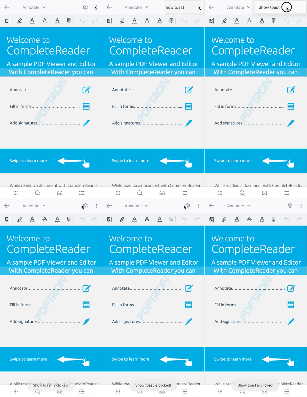
This sample replaces the navigation icon, removes all toolbar buttons except the annotation toolbar button, and adds a new Show Toast button:

Display PDF using PDFViewCTRL in Android
This tutorial only applies to Xamarin.Android. See Xamarin.iOS equivalent here .
If you are looking for a quick start on displaying documents in your application, please first take a look at Show a document in an Activity or Show a document in a Fragment as they are easier to setup and ready to launch from any activity or fragment. Continue reading this article if you are looking to embed PDFViewCtrl in your own layout.
Before beginning, make sure the Apryse library is initialized prior to inflating the layout or calling setContentView in your activity.
PDFViewCtrl is a ViewGroup that can be embedded in any layout. It encapsulates a rich set of functionalities for interactive viewing of PDF documents, including multi-threaded rendering, PDF rendering settings, scrolling, zooming, page navigation, different page viewing modes, coordinates conversion, text selection, text search, etc.
View documents using PDFViewCtrl
In this tutorial you will display a PDF file in your activity by using PDFViewCtrl.
- In your
AndroidManifest.xml, make sure you enablelargeHeapin the<application>tag. Also, add a custom theme and set theandroid:windowSoftInputMode:"adjustPan"attribute in the<activity>tag as follow:
XML
If your app is targeting Android SDK version 28 or higher, please also set the android:usesCleartextTraffic="true" attribute in your application tag to open HTTP files in the viewer. If you are only working with HTTPS files, this is not required.
- If you would like to customize the appearance of the viewer activity, define
PDFTronAppThemefor your activity inres/values/styles.xml:You can learn more about this in the customize the viewer's theme guide.
XML
PDFViewCtrl uses the AppCompat theme for material colors. Make sure that the value of android:theme in your <activity> tag also extends the AppCompat theme.
- Now, add
PDFViewCtrlto your activity's XML layout. For example:
XML
- In your activity, get a reference to
PDFViewCtrlafter inflating the layout and callAppUtils.SetupPDFViewCtrl.
C#
- Next, choose a document to display by using the following options:Add a sample PDF to
src/main/res/rawfolder, then call:
View from resource
C#
View from local device storage
Storage Permission
Please follow the latest Android best practices and guidelines outlined here
Managing lifecycle
It is extremely important that you follow the Android activity/fragment lifecycle and clean up PDFViewCtrl and PDFDoc properly. Make sure you have the following in lifecycle callbacks:
C#
Next steps
- Want to annotate on PDF files in
PDFViewCtrl? Check out the Setup ToolManager guide. - Want to display non-PDF files in
PDFViewCtrl? Check out the viewing other document types guide.
Did you find this helpful?
Trial setup questions?
Ask experts on DiscordNeed other help?
Contact SupportPricing or product questions?
Contact Sales