Product:
Customize a document view controller in Xamarin
Legacy Viewer
This guide is for the legacy PTDocumentViewController class. This class is no longer being updated. For the best viewing experience and to take advantage of new developments, the PTDocumentController should be used. Please see this guide for information.
This article explains how to customize the document viewer classes PTDocumentViewController and PTTabbedDocumentViewController.
Because the document viewer classes are part of the open source Tools UI framework, it is possible to achieve virtually any required modification. That said, it is usually faster and more convenient to configure the viewers via APIs, which this guide describes.
PTDocumentViewController
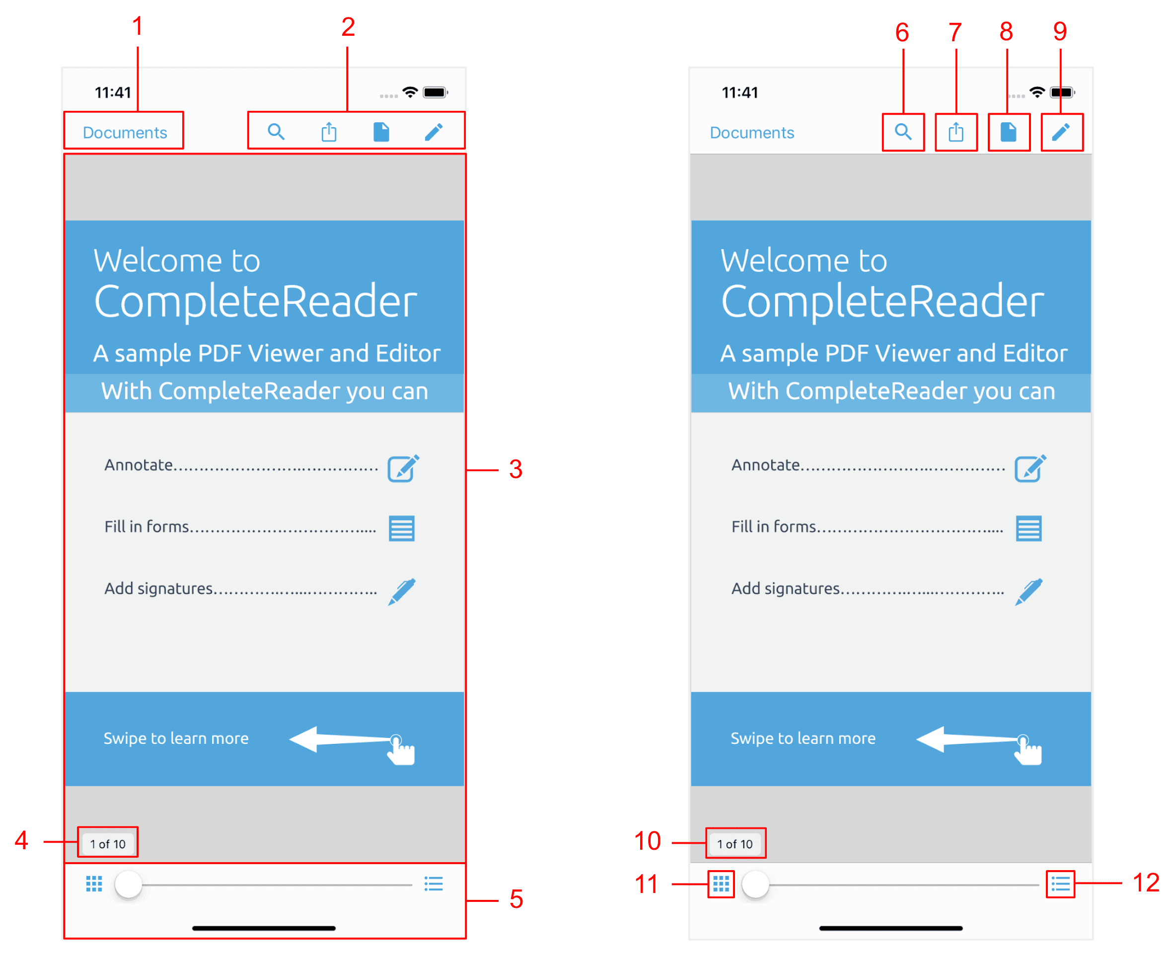
The image on the left indicates areas that are controllable via the PTDocumentViewController's API. Information on customizing these is available directly below.
The image on the right indicates a number of default buttons that create and present new controls. Information on where to look to customize these presented controls can be found in the component controls table.
1: Left bar button item
When presented in a UINavigationController, the PTDocumentViewController's left bar button item will display the name of the previous view controller's navigation item's title (or, if set, its backBarButtonItem). When presented as a UINavigationController's root controller, the space will be empty.
The PTDocumentViewController's left bar button item can be added or replaced as follows:
C#
2: Right bar button items
These buttons, which are contained in the rightBarButtonItems array, are completely customizable. It is possible to
Remove buttons
Default buttons can be removed ("hidden") using built-in properties. From left-to-right:
For example to hide the share and viewer settings buttons:
C#
Add buttons
Buttons can be added by accessing the appropriate BarButtonItem array and adding a button:
Adds a button to the top navigation bar:
C#
Move buttons
The default buttons are all accessible via properties, making it easy to rearrange or move them. The following code swaps the position of the search button and navigation lists button:
C#
Change icons
The icons of existing buttons may be changed by creating new UIBarButtonItems that have the same target and action as an existing item, and replacing the existing item with the new item:
C#
3: PDFViewCtrl
The PTPDFViewCtrl is a UIView that displays the PDF. It is customizable via is properties/methods and delegate methods.
For an overview see the PTPDFViewCtrl Guide , or the detailed API documentation.
Note that all PDF "interaction" (annotations, form filling, text selection, link following, etc.) is supplementary to the PDFViewCtrl, and is implemented in the open source tools.framework.
4: Page number indicator
The page indicator can be enabled/disabled via the pageIndicatorEnabled property.
5: Thumbnail slider controller
The thumbnail slider can be enabled/disabled via the bottomToolbarEnabled property.
The default buttons presented to the right and left of the slider are easily hidden through the convenience properties thumbnailBrowserButtonHidden and navigationListsButtonHidden on the PTDocumentViewController:
C#
6-12: Controls Presented by a PTDocumentViewController
To customize the controls that are presented by the PTDocumentViewController's default buttons, please see the corresponding guide or API:
Image number | Control |
|---|---|
6 | |
7 | |
8 | |
9 | |
10 | |
11 | |
12 |
PTTabbedDocumentViewController
The tabbed document view controller displays a collection of document viewer controllers in tabs.
Tab Settings
Tabs can be disabled using the TabsEnabled property, and the maximum number of allowed tabs can be set using MaximumTabCount.
Access to child PTDocumentViewControllers
The current document view controller can be accessed via SelectedViewController, and others via documentViewControllerAtIndex
To configure a document view controller before it is displayed, conform to and implement the PTTabbedDocumentViewControllerDelegate method willAddDocumentViewController. Note that it is permissible to assign the internal PTDocumentViewController's delegate to an external object.
C#
Summary
API | Functionality |
|---|---|
Enables/disables tabs. | |
Controls the maximum number of concurrent tabs. | |
The current | |
The | |
Access to a |
Did you find this helpful?
Trial setup questions?
Ask experts on DiscordNeed other help?
Contact SupportPricing or product questions?
Contact Sales