Product:
Thumbnail slider
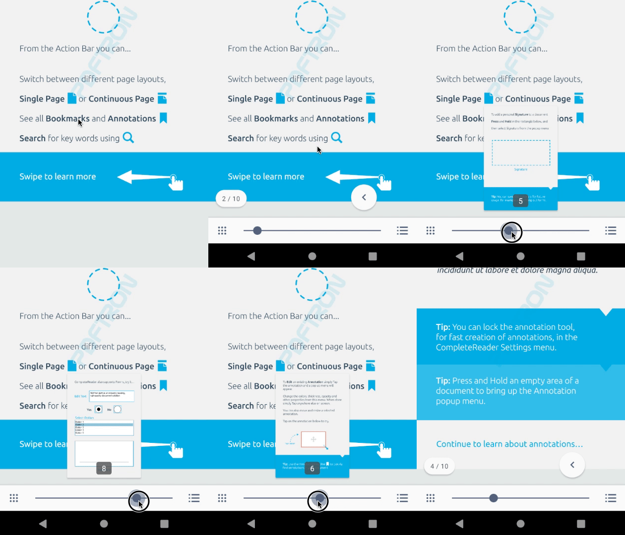
You can use the slider to get a thumbnail review of pages before they are actually shown in the viewer.
Adding PDF page slider in Xamarin.Android
This tutorial only applies to Xamarin.Android. See Xamarin.iOS equivalent here .
ThumbnailSlider is a LinearLayout that contains an AppCompatSeekBar to change pages, and two AppCompatImageButton on the left and right side. When sliding the seekbar, it displays a small page preview on top of the thumbnail slider.

Show thumbnail slider
To set up your layout with the thumbnail slider, add a <ThumbnailSlider> element to your XML layout. For example, your layout may look like this:
XML
Then, attach a PDFViewCtrl to the thumbnail slider. If PDFViewCtrl is in the same layout, you can set it by adding the app:pdfviewctrlId attribute:
XML
If PDFViewCtrl is not in the same layout, you can programmatically set it to a thumbnail slider by calling setPdfViewCtrl(PDFViewCtrl):
C#
Change thumbnail slider buttons
You can change the image drawable of the left menu item and right menu item buttons by adding the app:leftMenuItemDrawable and app:rightMenuItemDrawable attributes in your xml layout.
Example
XML
Additionally, you can remove the left and right slider buttons by setting the drawables to null:
C#
You can also change the buttons programmatically by calling setMenuItem(@DrawableRes int, @MenuItemPosition int). The second parameter determines the position of the button which is either POSITION_LEFT or POSITION_RIGHT.
Example
C#
Thumbnail slider listeners
Buttons listener
You can add a menu item clicked event listener by calling MenuItemClicked to be notified when one of the left or right buttons is clicked.
C#
Seekbar listener
You can set a thumbnail slider seekbar event listener by calling ThumbSliderStartTrackingTouch and ThumbSliderStopTrackingTouch:
C#
Appearance style
Customize slider colors
You can customize the color of the left and right menu buttons as well as the seekbar by setting a custom style to the thumbnail_slider attribute in your apps's theme. The custom style must extend ThumbnailSliderStyle. For example:
XML
Customize seekbar attributes
If you want to further customize the seekbar's layout attributes and appearance, such as padding and height, you can override the default seekbar style Resource.Style.ThumbnailSliderStyle.Seekbar by declaring the following in Resources/Values/styles.xml:
Example
For API < 21:
XML
For API >= 21:
XML
Customize the thumb and progress bar
The seekbar progress bar drawable can be customized by overriding the seek_track_material.xml drawable file. Similarly, the seekbar thumbnail drawable can be changed by overriding the seek_thumb.xml drawable file. For reference, the source code for these drawables can be found in the lib\src\PDFViewCtrlTools\res\drawable folder of the SDK package.
XML attributes
Attribute | Description | Format |
|---|---|---|
| Specifies the | Reference |
| Specifies the content description of left menu item. | String |
| Specifies the content description of right menu item. | String |
| Specifies left menu item drawable resource. | Reference |
| Specifies right menu item drawable resource. | Reference |
| Specifies background color. Uses default system background color if not defined. | Color |
| Specifies seekbar progress bar and thumb color. | Color |
| Specifies left menu item color. | Color |
| Specifies right menu item color. | Color |
| Specifies whether the shadow will appear. Default value: | Boolean |
Adding PDF page slider in Xamarin.iOS
This tutorial only applies to Xamarin.iOS. See Xamarin.Android equivalent here .
The PTThumbnailSliderViewController class allows the user to quickly navigate through a document. When using the slider control, a small page preview pop will be shown on top of the thumbnail slider.
Note: If you are using the new UI, we recommend the PTDocumentSliderViewController class, which displays a scroll indicator for the current scroll position and allows the user to quickly skip through pages.

The thumbnail slider control is part of the Tools library, so make sure you have added the Tools library to your project.
Show a thumbnail slider
To create and set up a thumbnail slider, supply a PTPDFViewCtrl instance to the PTThumbnailSliderViewController designated initializer:
C#
Populate with thumbnail images
The thumbnail images shown in the thumbnail slider view controller are generated by the GetThumbAsync: method of the PTPDFViewCtrl class. When ready, the thumbnail images are provided to the pdfviewCtrl's delegate via the pdfViewCtrl:gotThumbAsync:thumbImage: method.
In your class adopting the PTPDFViewCtrlDelegate protocol (usually the same view controller containing the thumbnail slider view controller), add the following:
C#
Customization
The PTThumbnailSliderViewController provides a flexible API for displaying buttons on either side of the slider control. This is possible with the following properties:
LeadingToolbarItem - a single UIBarButtonItem to the left of the slider.LeadingToolbarItems - an array of UIBarButtonItems to the left of the slider.TrailingToolbarItem - a single UIBarButtonItem to the right of the slider.TrailingToolbarItems - an array of UIBarButtonItems to the right of the slider.
It is also possible to remove these buttons by setting the appropriate property to nil.
For example, to show a button to present a PTThumbnailsViewController on the left of the slider, and a button to present a PTNavigationListsViewController on the right:
C#
The thumbnail slider delegate
The PTThumbnailSliderViewDelegate protocol allows the adopting class (usually the containing view controller, as in this guide) to be notified when the user is actively using the thumbnail slider. The thumbnail slider already handles changing the current page in response to user actions, but the delegate methods can be used to hide or show other content as appropriate.
Did you find this helpful?
Trial setup questions?
Ask experts on DiscordNeed other help?
Contact SupportPricing or product questions?
Contact Sales