Product:
UI components
Apryse SDK provides various UI components to make a large degree of customization available to the user.
Viewer UI component configuration in Xamarin.Android
This tutorial only applies to Xamarin.Android.
The highly configurable all-in-one document reader and PDF editor that comes with the Apryse Android SDK is composed of Material Design UI components that are available in the tools package. These components can be used as part of your application to create customizable UI that interact with the document viewer. A visual reference for these components is shown below:

Key | UI Component | Description |
|---|---|---|
1 | PDFViewCtrl is a ViewGroup that can be embedded in any layout. It encapsulates a rich set of functionalities for interactive viewing of documents | |
2 | Toolbar Switcher | Allows users to switch between annotation toolbars and access different tools |
3 | Tab Switcher | View the previews of multiple documents as tabs |
4 | Allows users to: pick page presentation mode, select page color mode, rotate pages, and crop pages | |
Manually or automatically crop pages in a document | ||
Extract the reflowable layout of each page in a document to an HTML file | ||
Add new pages to an existing document or create a new document with new pages | ||
Rotate pages of the opened document by 90, 180 and 270 degrees | ||
Share document | Share a document from your app | |
5 | Edit pages of a document including add, remove, re-arrange, rotate and duplicate pages | |
6 | Search text in a document | |
7 | Strips down the UI so that users can focus on reading a document's content | |
8 | List container | A horizontal layout to display the Annotation list, Document outline, and User-defined bookmark list in separate tabs |
Shows a list of all annotations in a document | ||
Shows a document outline (PDF Bookmark) that can be used to navigate the document | ||
Shows a list of user-defined bookmarks that can be used to navigate the document | ||
9 | A toolbar consisting of various annotation creation tools | |
10 | A convenient annotation popup menu that appears when a user long-presses on a blank space or on text, or presses an annotation | |
11 | Displays annotation style properties in a bottom sheet for the user to edit |
Viewer UI component configuration in Xamarin.iOS
This document refers to the PTDocumentController
For the legacy PTDocumentViewController class, please see this guide .
This article explains how to customize the document viewer classes PTDocumentController and PTTabbedDocumentViewController.
Because the document viewer classes are part of the open source Tools UI framework, it is possible to achieve virtually any required modification. That said, it is usually faster and more convenient to configure the viewers via APIs, which this guide describes.
PTDocumentController

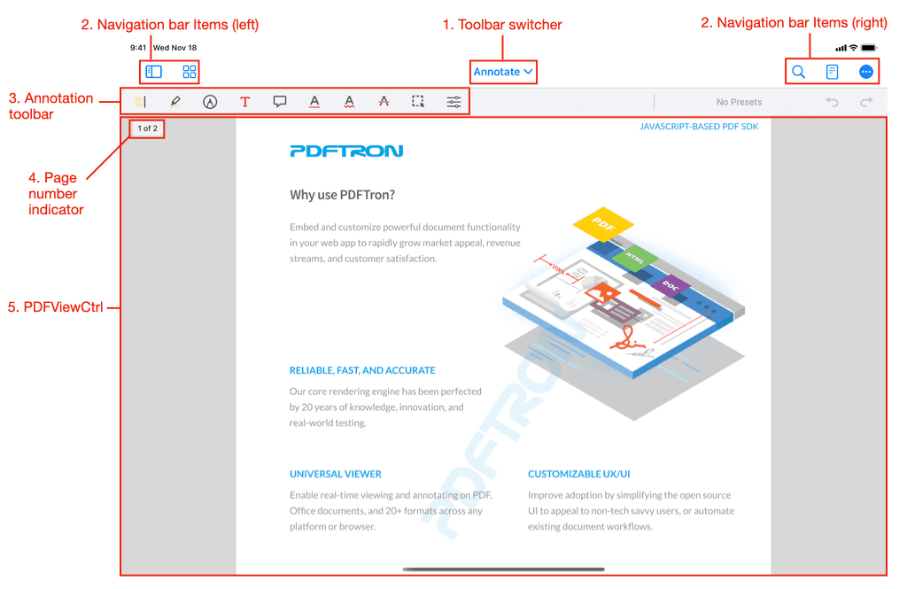
The above image (items 1–5) indicates areas that are controllable via the PTDocumentController's API. Information on customizing these is available directly below.

The above image (items 7–12) indicates a number of default buttons that create and present new controls. Information on where to look to customize these presented controls can be found in the component controls table.

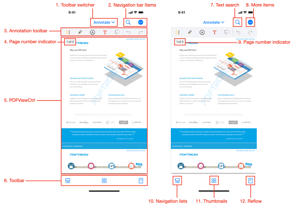
The image on the left (items 1–6) indicates areas that are controllable via the PTDocumentController's API. Information on customizing these is available directly below.
The image on the right (items 7–12) indicates a number of default buttons that create and present new controls. Information on where to look to customize these presented controls can be found in the component controls table.
On iPad and other regular horizontal size class devices, a number of default UI controls are accessible from the navigation bar, whereas on iPhones and compact size classes some of those controls appear in the toolbar at the bottom of the view.
Image Number | Button | Functionality | Location on iPad | Location on iPhone |
|---|---|---|---|---|
7 | searchButtonItem | navigationItem.rightBarButtonItems | navigationItem.rightBarButtonItems | |
8 | moreItemsButtonItem | navigationItem.rightBarButtonItems | navigationItem.rightBarButtonItems | |
10 | navigationListsButtonItem | navigationItem.leftBarButtonItems | toolbar | |
11 | thumbnailsButtonItem | navigationItem.leftBarButtonItems | toolbar | |
12 | readerModeButtonItem | navigationItem.rightBarButtonItems | toolbar |
1: Toolbar switcher
Hide the toolbar switcher
The toolbar switcher can be hidden:
C#
Remove toolbars from the switcher
Toolbars can be removed by removing them from the toolGroupManager's groups array. The following code removes the "Draw" and "Pens" toolbars:
C#
2: Navigation bar items
The buttons which are contained in the leftBarButtonItems and rightBarButtonItems arrays, are completely customizable. It is possible to
Add buttons
You can modify the navigation bar items. Here is an example of adding a new button (for the current size class):
C#
Tools can also be added:
C#
Note that in the example above, de-selecting the tool button item needs to be implemented by the app, by listening to the Tool Did Change notification.
Remove buttons
To remove any of the default buttons see the instructions here: Hide default buttons
Move buttons
The default buttons are all accessible via properties, making it easy to rearrange or move them. The following code swaps the position of the search button and navigation lists button:
C#
Change icons
The icons of existing buttons may be changed by creating new UIBarButtonItems that have the same target and action as an existing item, and replacing the existing item with the new item:
C#
3: Annotation toolbar
The currently-visible annotation toolbar is selected with the toolbar switcher.
Hide (and show) the annotation toolbar
The toolbar can be programmatically hidden by setting the mode to view group, which is a special group and the only group where the toolbar is hidden:
C#
The toolbar can be shown again by changing the group to any group other than view:
C#
Remove buttons from a toolbar
The example below shows how to remove the text highlight and text underline button from a toolbar.
Disabling a tool type entirely
If you want to disable a tool entirely, from all toolbars and the long press menu, please use the annotations permissions system.
C#
Add a tool button to a toolbar
C#
4: Page number indicator
The page indicator can be enabled/disabled via the pageIndicatorEnabled property.
5: PDFViewCtrl
The PTPDFViewCtrl is a UIView that displays the PDF. It is customizable via is properties/methods and delegate methods.
For an overview see the PTPDFViewCtrl Guide , or the detailed API documentation.
Note that all PDF "interaction" (annotations, form filling, text selection, link following, etc.) is supplementary to the PDFViewCtrl, and is implemented in the open source tools.framework.
6. Toolbar (iPhone only)
These are the buttons that appear at the bottom of the screen on iPhones and in Compact horizontal size classes. Buttons can be added, removed, or rearranged with convenient APIs.
Add buttons to toolbar
Remove buttons from toolbar
To remove any of the default buttons see the instructions here: Hide default buttons
7-12: Controls Presented by a PTDocumentController
To customize the controls that are presented by the PTDocumentController's default buttons, please see the corresponding guide or API:
Image number | Control |
|---|---|
7 | |
8 | |
9 | |
10 | |
11 | |
12 |
Hide default buttons
Default buttons can be removed ("hidden") using built-in properties.
searchButtonHiddenmoreItemsButtonHiddennavigationListsButtonHiddenthumbnailBrowserButtonHiddenreaderModeButtonHidden
For example to hide the search and more items buttons:
C#
PTTabbedDocumentViewController
The tabbed document view controller displays a collection of document controllers in tabs.
Tab Settings
Tabs can be disabled using the TabsEnabled property, and the maximum number of allowed tabs can be set using MaximumTabCount.
Access to child PTDocumentControllers
The current document controller can be accessed via SelectedViewController, and others via documentViewControllerAtIndex
To configure a document controller before it is displayed, conform to and implement the PTTabbedDocumentViewControllerDelegate method willAddDocumentViewController. Note that it is permissible to assign the internal PTDocumentViewController's delegate to an external object.
C#
Summary
API | Functionality |
|---|---|
Enables/disables tabs. | |
Controls the maximum number of concurrent tabs. | |
The current | |
The | |
Access to a |
Did you find this helpful?
Trial setup questions?
Ask experts on DiscordNeed other help?
Contact SupportPricing or product questions?
Contact Sales