Product:
New Document Viewer UI
New Document Viewer UI in Xamarin.Android
Starting with Version 7.1.5, Apryse's Android SDK ships with a brand new viewer PdfViewCtrlTabHostFragment2 which includes an updated user interface containing: improvements to the annotation toolbar, a better multi-tab navigation experience, improvements to stamp and signature flows, and more. PdfViewCtrlTabHostFragment2 is a drop-in replacement for PdfViewCtrlTabHostFragment and steps for migrating from the old viewer can be found in migration guides.
PdfViewCtrlTabHostFragment will continue to use the existing UI, however this will be deprecated in future versions of Apryse.
Annotation Toolbar
The annotation toolbar has been completely revamped in order to accommodate our ever expanding set of tools. The Pan tool bas been removed from the toolbar and the toolbar itself is now scrollable. By default when no tools are selected in the toolbar, the pan tool is selected.
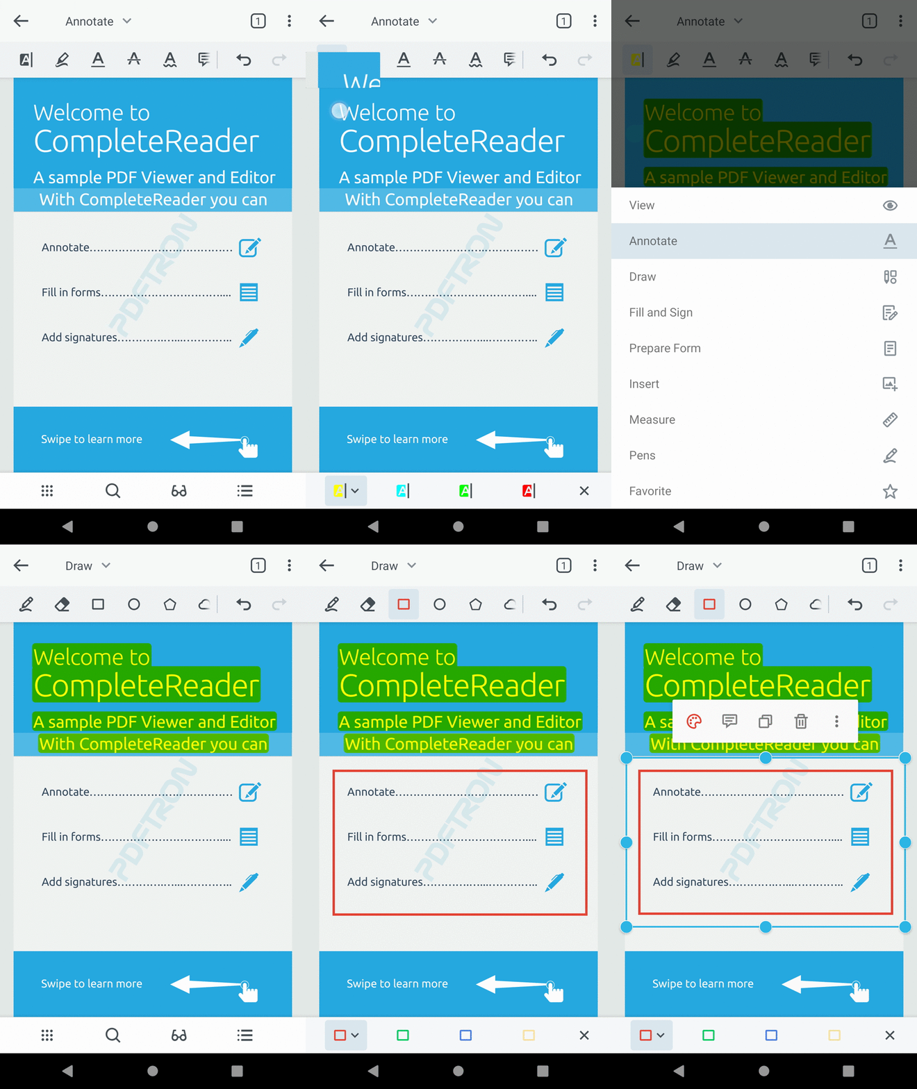
Annotation Toolbar Switcher
In order to help users find the right tool for the job, we've grouped the tools into specific toolbars. For example some new toolbars are: Annotation Toolbar, Draw Toolbar, Fill and Sign Toolbar, Prepare Form Toolbar, Insert Toolbar, Measure Toolbar, and Pens Toolbar.
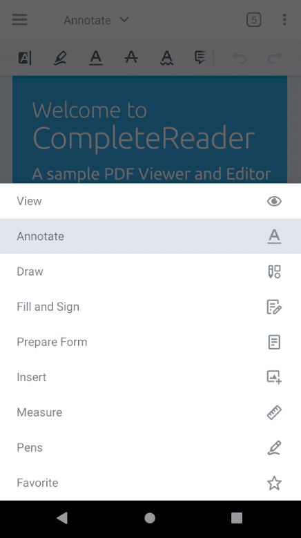
Multi-tab Switcher Dialog
The tab layout for switching between multiple documents in the viewer has been removed on Phones. Instead a new multi-tab switcher has been added to let users manage their document tabs.
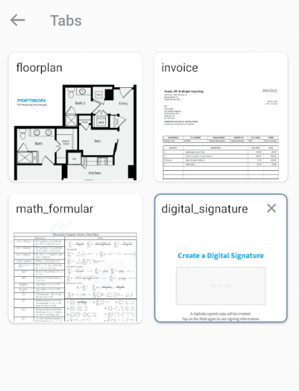
Preset Bar
A new preset bar has been added to let users quickly switch between styles when creating annotations.
Bottom Navigation Bar
The bottom navigation bar has revamped and provides one-tap access to: the page thumbnail viewer, text search, reading mode, and the annotation/outline/bookmark list. The thumbnail slider has been moved to another part of the viewer, which is described in the next section.
Thumbnail Slider
The thumbnail slider will now be shown horizontally above bottom navigation bar if the viewer is in horizontal scroll mode.
If the viewer is in vertical scroll mode, the thumbnail slider will now shown vertically along the right edge of the viewer.
Edit Toolbars
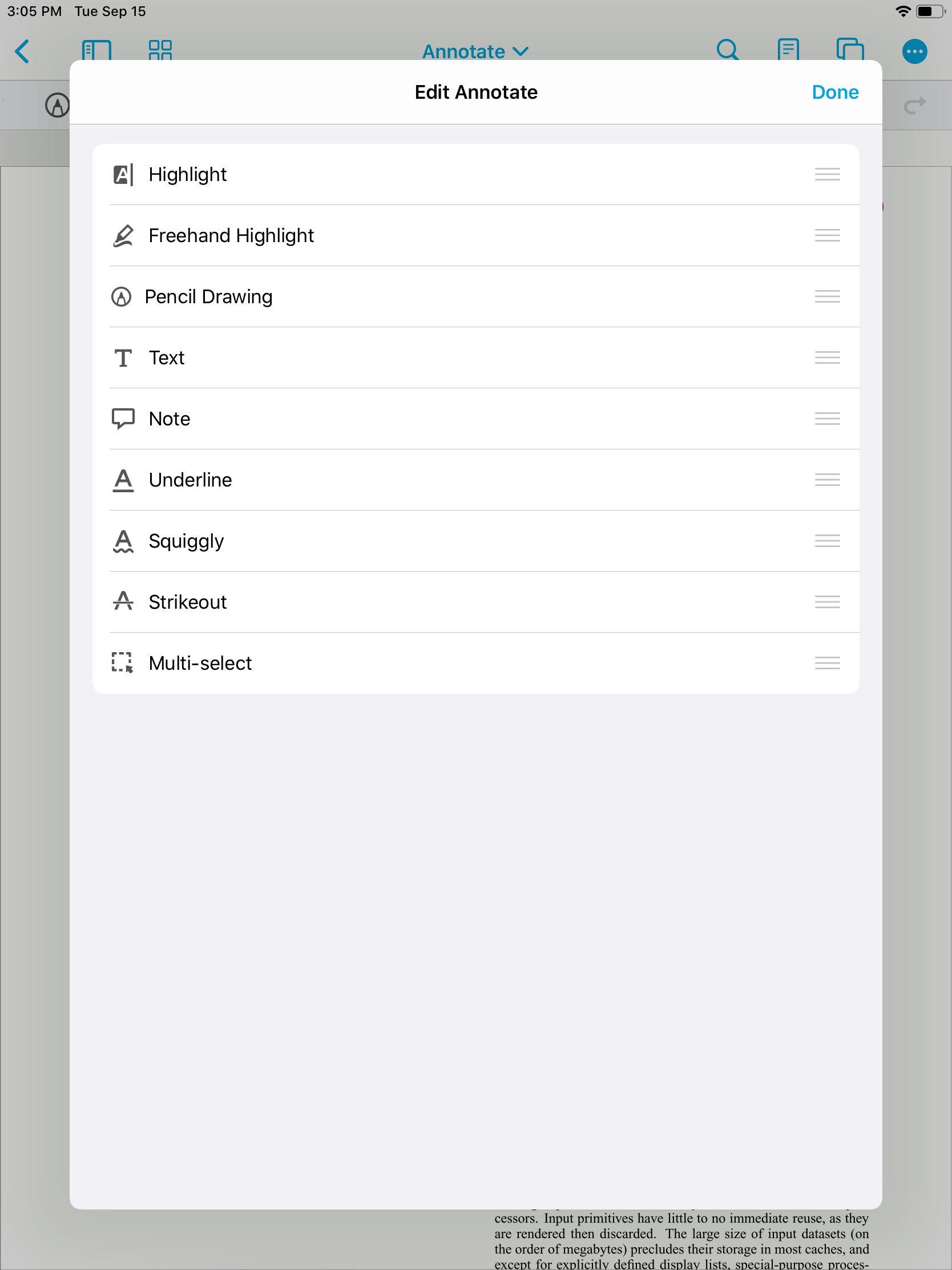
Tools in the annotation toolbars can be arranged by the user to fit their needs.
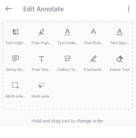
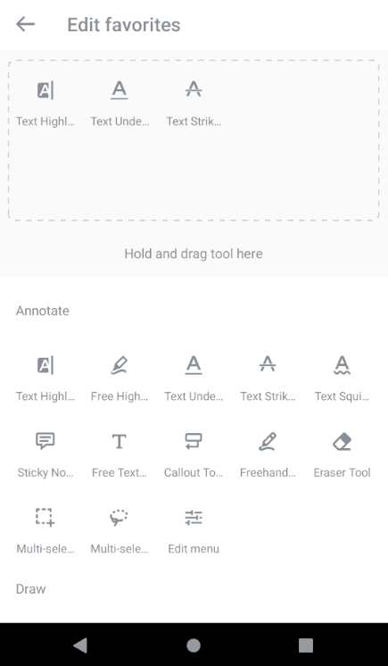
Favorite Toolbar
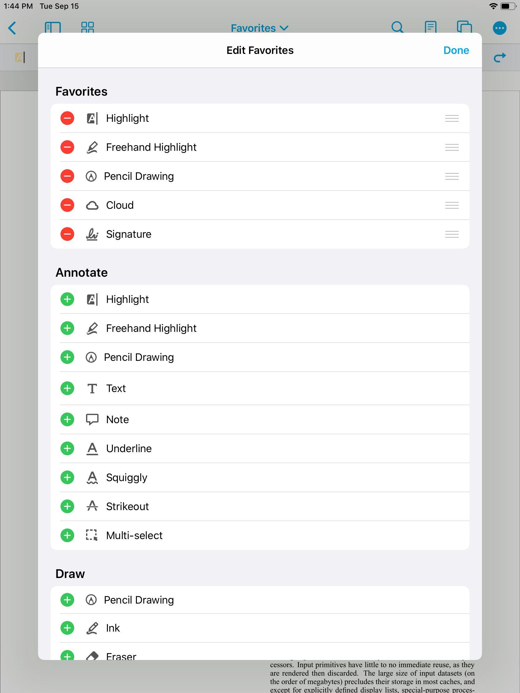
In addition, users can now build their own toolbar from scratch using any one of our annotation toolbar tools.
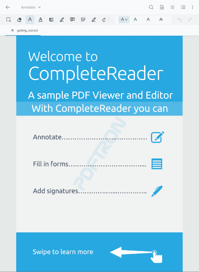
Tablet User Interface
For tablet devices, the user interface is slightly modified to better fit the larger screen size. The bottom navigation bar is removed,and the buttons are moved to the toolbar menu, In addition, the preset bar is embedded in the annotation toolbar to make use of the extra space and provide more room to view the document.
New Document Viewer UI in Xamarin.iOS
Starting with Version 7.1.5 Apryse's iOS SDK, we introduce a new and improved UI for our document viewer:
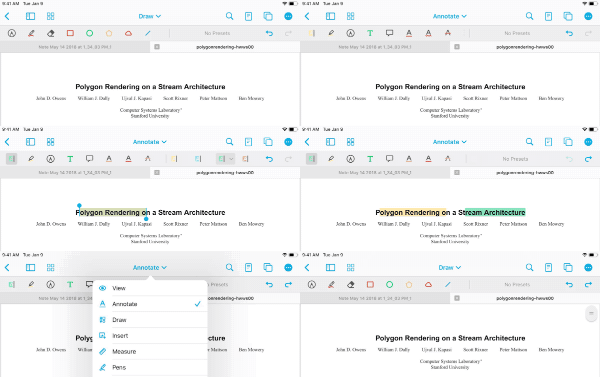
The UI is:
- Easily customizable by APIs
- Provides an excellent UX and attractive UI
- Can show annotation tools concurrently with the main UINavigationBar
- Accommodates an unlimited number of tools (and toolbars)
- Is user-customizable
This functionality is part of the new class PTDocumentController, which is a near drop-in replacement for PTDocumentViewController.
Annotation Toolbar
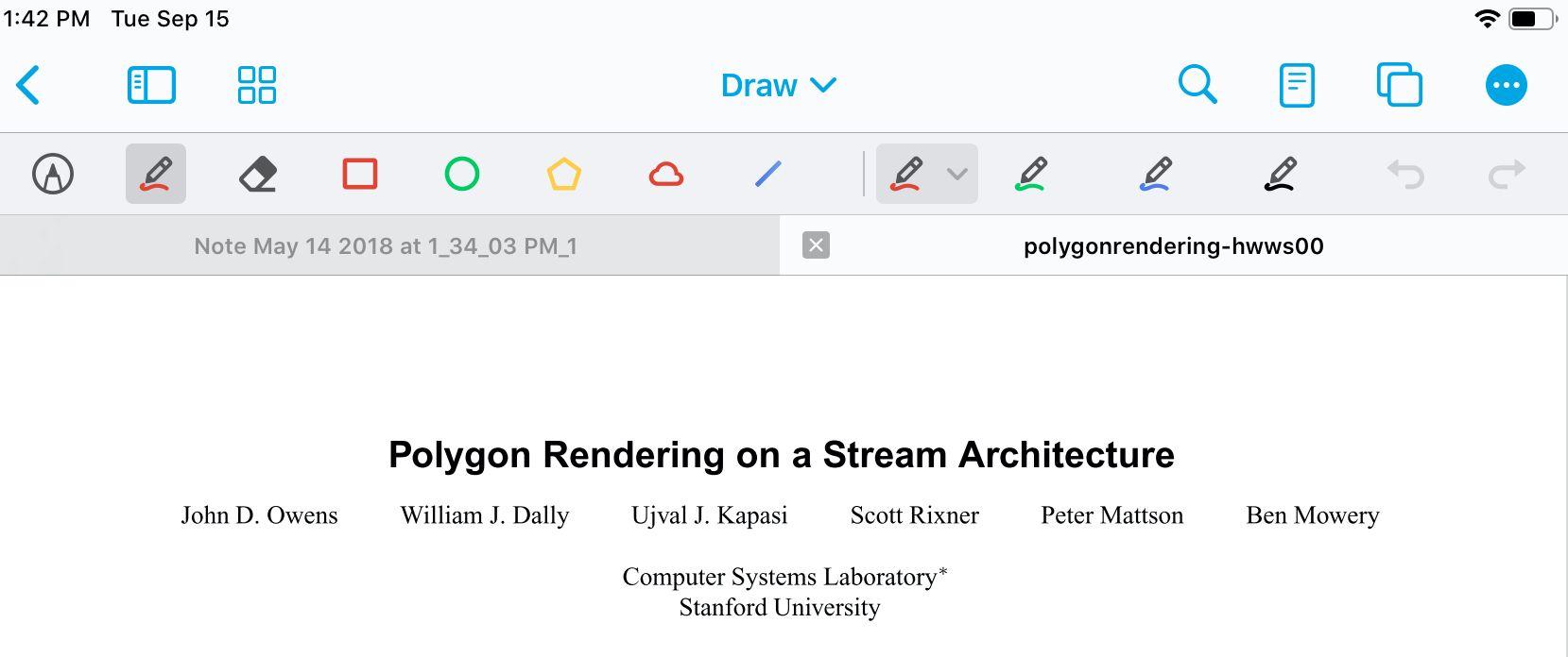
The annotation toolbar has an attractive look. The toolbar scrolls horizontally, allowing it to host any number of tools. Frequently accessed undo/redo buttons are "sticky", and are always available:
Multiple Toolbars
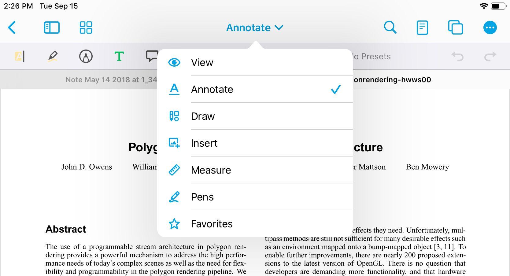
Multiple toolbars are supported, and can be switched between using a toolbar chooser. A number of standard toolbars are included, including "View", "Annotate", "Shapes", and "Insert". These are completely customizable, both the name and number of toolbars, which tools they contain, and what order they are displayed in, so that it can fit your app's requirements exactly.
View mode
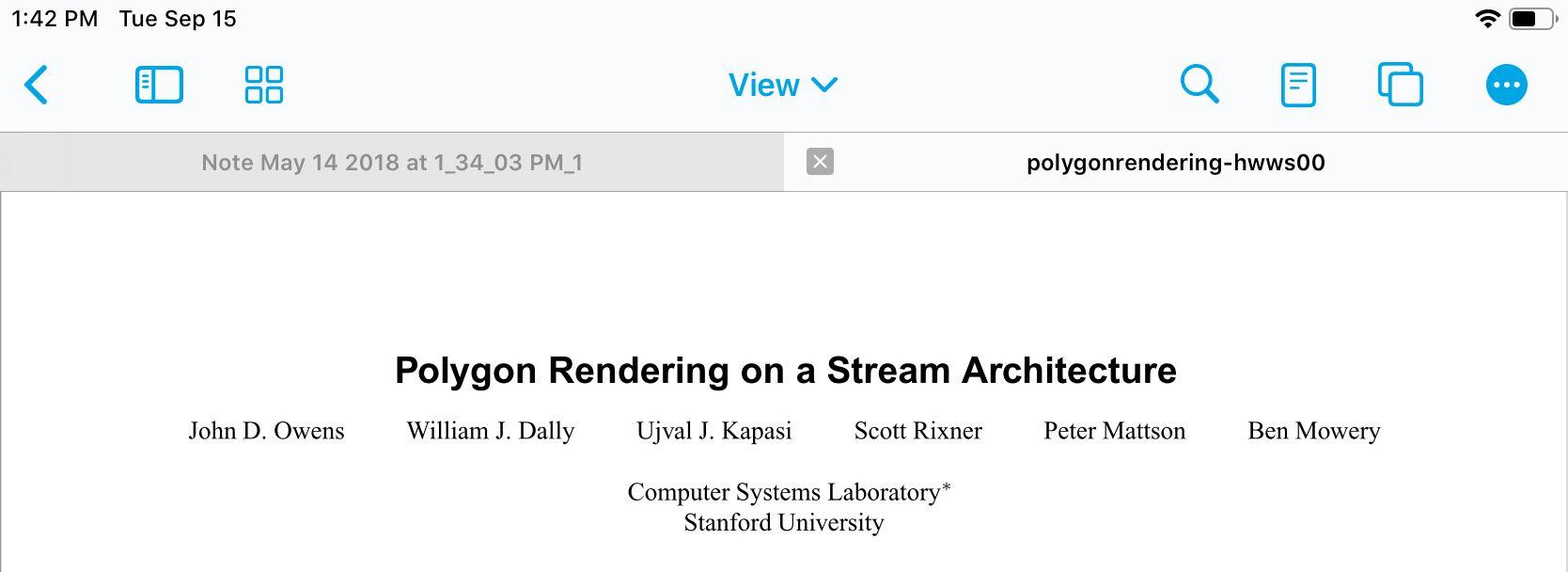
The UI also includes a "View Mode", which hides the annotation toolbar.
Presets
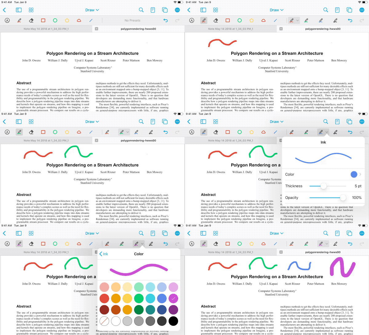
Annotation tools support presets, so that a user can quickly change between styles of the same tool. For example when the pen tool is active, switching from red to green, and then back to red, are both single-tap operations.
Bottom Bar
On iPhone, the bottom bottom bar includes one-touch access to viewing and navigation actions, which enables single-handed viewing. These actions include the annotation/bookmarks/outlines/layers lists, thumbnails, reader mode and a Safari-inspired tabs button.
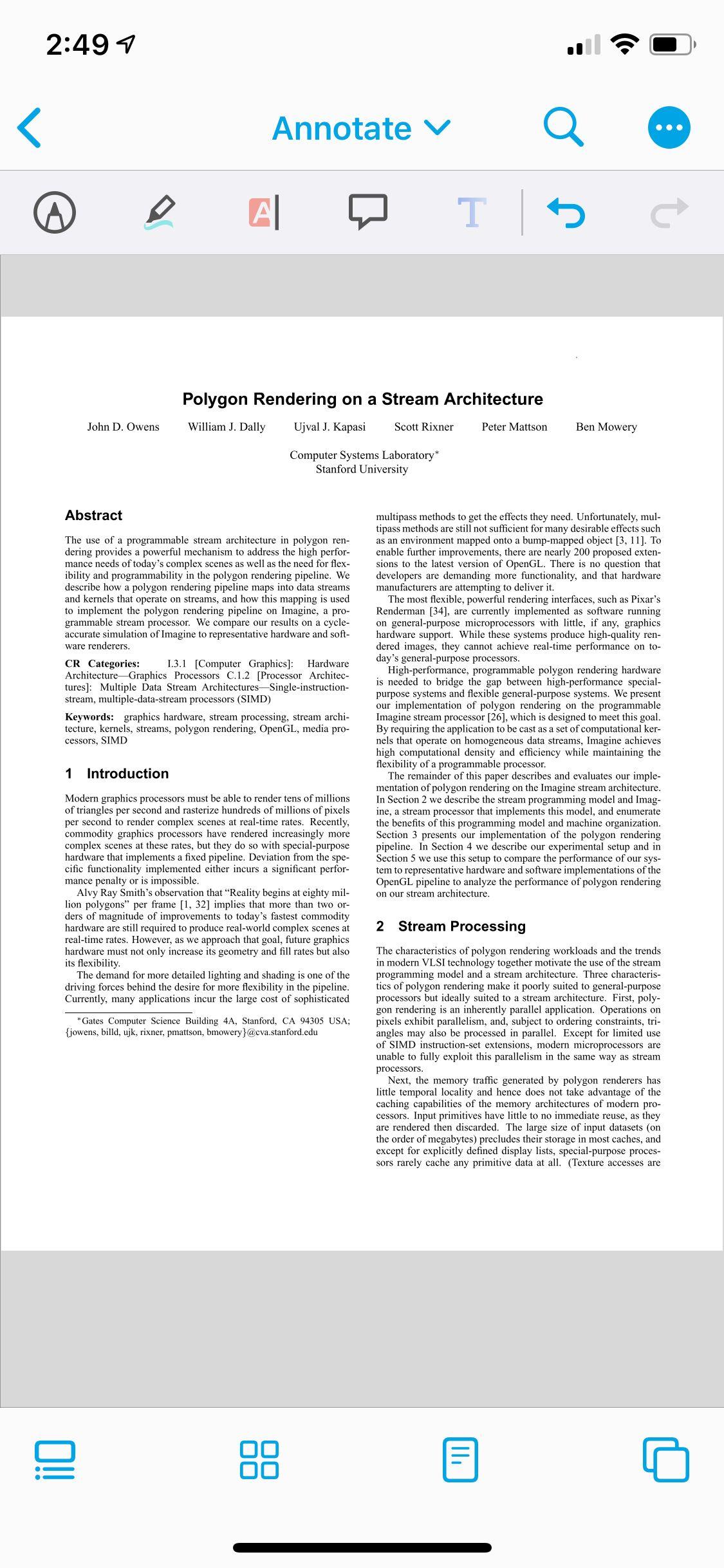
Of course, this area is completely customizable for your app's purposes.
Thumbnail Slider
The thumbnail slider moves horizontally or vertically with the direction of scroll.
User toolbar customization
If your app contains many tools, the new UI allows the user to customize it to their preference.
This includes the ability to re-order tools in a toolbar:
As well as create a fully-custom "favorite" toolbar:
Did you find this helpful?
Trial setup questions?
Ask experts on DiscordNeed other help?
Contact SupportPricing or product questions?
Contact Sales