Product:
Adding walkthrough or product tour in WebViewer
WebViewer Walkthrough is a package that allows you to create step-by-step walkthroughs or tutorials in WebViewer.
Create a walkthrough
Install
To create the walkthrough, ensure that you also have @pdftron/webviewer-walkthrough installed by running npm i @pdftron/webviewer-walkthrough. Then import the package and destructure the initializeWalkthrough function.
JavaScript
Define steps
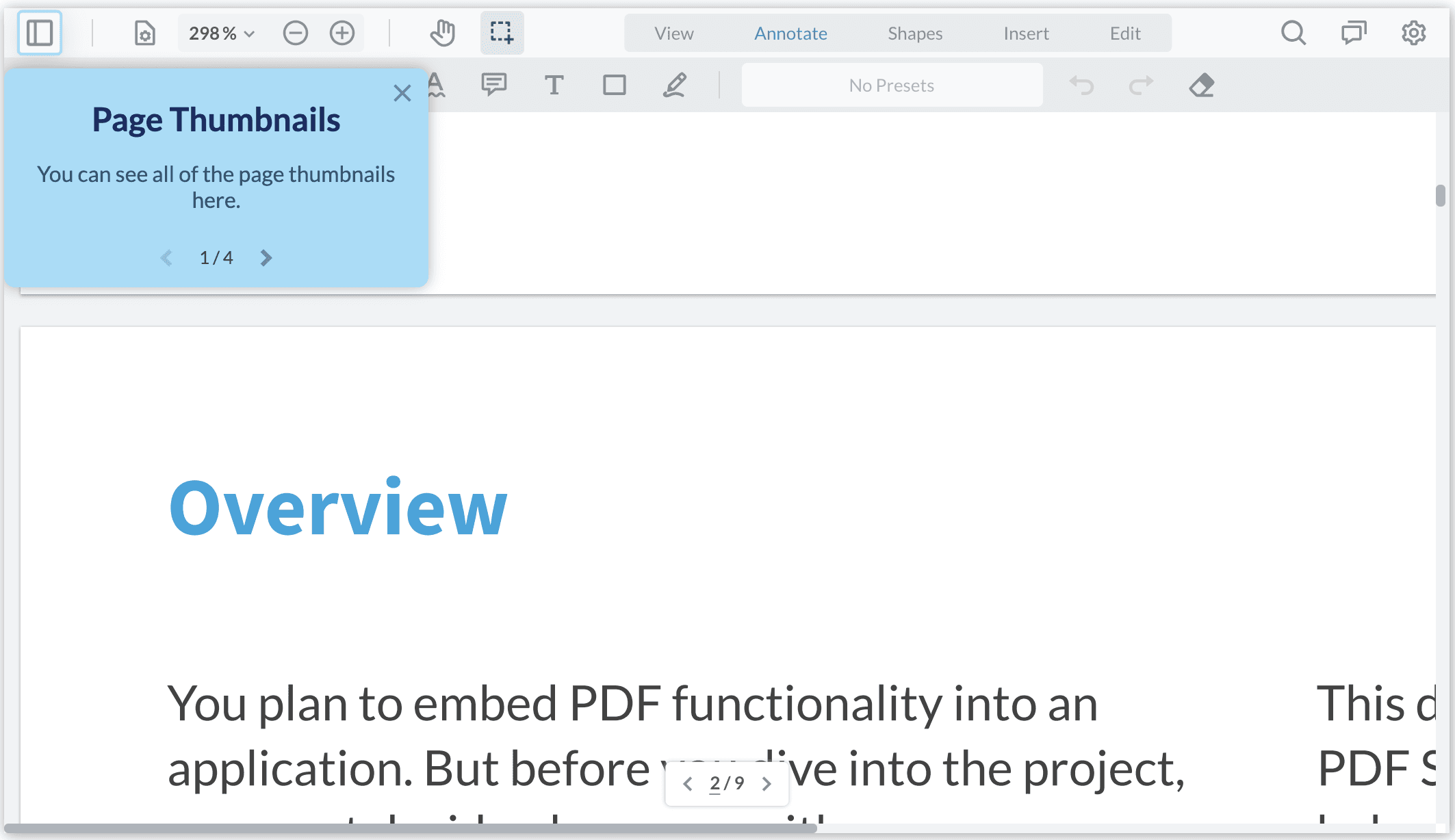
Create an array of Step objects that contain the follow keys:
dataElement: The UI element where you want to get the user's attentionheader(optional): The header text that is rendered in the pop-uptext: The descriptive text that is rendered in the pop-up
JavaScript
To find the correct dataElement please refer to the guide about how to show/hide elements.
Initialize the walkthrough
Once you have an array of Step objects defined, call initializeWalkthrough function with the following parameters:
viewerElement: The same element that WebViewer is mounted on (i.e. the second argument to the WebViewer constructor)steps: The array ofStepobjects defined abovecallback: AnonCompletecallback function that is invoked upon completion of all the stepsoptions: An object that customizes the pop-up, see the section Customizing the steps
JavaScript
Start the walkthrough
The initializeWalkthrough returns an object containing two functions: start and exit. start function begins the walkthrough and exit ends the walkthrough when invoked. The walkthrough can also be terminated by the user via the X button in the top-right corner of any pop-up.
JavaScript
Customizing the steps
You can customize the appearance of the card as well, by passing options object containing colors:
JavaScript
Did you find this helpful?
Trial setup questions?
Ask experts on DiscordNeed other help?
Contact SupportPricing or product questions?
Contact Sales