Hiding/Showing DOM elements in WebViewer UI

Hiding or customizing visual components is a key part of tailoring the WebViewer UI to your application’s needs. With Webviewer UI you can leverage its modularity to hide visual elements from headers, but also use data-elements to hide specific elements in other areas such as panels and modals.

Hiding Elements with the Modular UI

With the introduction of the Modular UI, you no longer need to rely on data-element attributes to show or hide individual controls. Instead, you can use the Modular UI APIs to replace entire groups of items in one go—giving you far more flexibility.

For example, suppose you only want the Shapes and Edit ribbons in your toolbar. Instead of hiding every other ribbon by its data-element, you can filter out the ones you don’t need and call setItems:

JavaScript (SDK v11.4+)

1WebViewer({ /* …options */ }, viewerElement).then(instance => {
2 const { UI } = instance;
3 // Grab the default ribbon group
4 const ribbonGroup = UI.getRibbonGroup('default-ribbon-group');
5
6 // Keep only the Shapes and Edit ribbons
7 const filteredItems = ribbonGroup.items.filter(item =>
8 item.dataElement === 'toolbarGroup-Shapes' ||
9 item.dataElement === 'toolbarGroup-Edit'
10 );
11
12 // Replace the entire group with your filtered list
13 ribbonGroup.setItems(filteredItems);
14 });


This approach also works for removing dividers or any other components: simply filter them out of the items array and call setItems on the container, header, or grouped-items you’re targeting. In the previous example, we filtered by dataElement, but you can also filter by other properties, such as type.

For instance, to remove all dividers from the Default Top Header, which are located in the groupedLeftHeaderButtons container, you could write:

JavaScript (SDK v11.4+)

1WebViewer({ /* …options */ }, viewerElement).then(instance => {
2 const { UI } = instance;
3 // Get the grouped-items container for the left side of the top header
4 const groupedLeft = UI.getGroupedItems('groupedLeftHeaderButtons');
5
6 // Filter out any items whose type is "divider"
7 const withoutDividers = groupedLeft.items.filter(item => item.type !== 'divider');
8
9 // Replace with the filtered list
10 groupedLeft.setItems(withoutDividers);
11});

Hiding by finding data-element attribute values

For non-Modular UI components, you can still hide or show DOM elements by targeting their data-element attribute. To find the correct value, inspect the element in the DOM. For example, if we inspect the left panel,

Apryse Docs Image

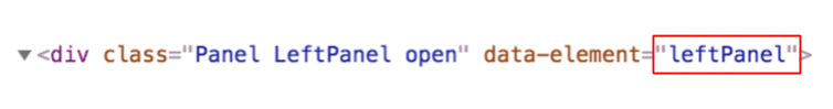
we can find that it has a data-element value of leftPanel. Now we can use that value to hide/show it.

You can view the full list of data elements in our open source UI repo.

Constructor option

If you wish to disable elements before the initial render there are two options. You can disable by loading an initial configuration file that only includes the items you wish to render, or you can pass a list of data-elementsthat you wish to disable.

Using a configuration file

This can be done using a JSON config file in which you can define the Modular Components (ie. Buttons, Ribbon Items, Grouped Items), Modular Headers, Flyouts, and Panels that you want to use and then importing it into the UI.

JavaScript

1Webviewer.WebComponent(
2 {
3 path: '/path/to/your/webviewer',
4 initialDoc: '/path/to/your/document.pdf',
5 },
6 viewerElement
7).then((instance) => {
8 const configUI = {
9 "modularComponents": {
10 "myButton": {
11 "type": "customButton",
12 "dataElement": "myButton",
13 "label": "My Button",
14 "onClick": "alertClick"
15 },
16 "flyoutToggle": {
17 "type": "toggleButton",
18 "img": "ic-hamburger-menu",
19 "dataElement": "flyoutToggle",
20 "toggleElement": "myFlyout"
21 },
22 "flyoutFirstButton": {
23 "type": "customButton",
24 "dataElement": "flyoutFirstButton",
25 "label": "Flyout First Button",
26 "children": [
27 "flyoutSecondButton"
28 ]
29 },
30 "flyoutSecondButton": {
31 "type": "customButton",
32 "dataElement": "flyoutSecondButton",
33 "label": "Flyout Second Button",
34 "onClick": "flyoutSecondButtonOnClick"
35 },
36 "searchPanelToggle": {
37 "type": "toggleButton",
38 "img": "icon-header-search",
39 "dataElement": "searchPanelToggle",
40 "toggleElement": "myPanel"
41 }
42 },
43 "modularHeaders": {
44 "myHeader": {
45 "dataElement": "myHeader",
46 "placement": "top",
47 "items": [
48 "flyoutToggle",
49 "myButton",
50 "searchPanelToggle"
51 ]
52 }
53 },
54 "panels": {
55 "myPanel": {
56 "dataElement": "myPanel",
57 "location": "left",
58 "render": "searchPanel"
59 }
60 },
61 "flyouts": {
62 "myFlyout": {
63 "dataElement": "myFlyout",
64 "items": [
65 "flyoutFirstButton"
66 ]
67 }
68 }
69 };
70
71 const functionMap = {
72 'alertClick': () => alert('Alert triggered!'),
73 'flyoutSecondButtonOnClick': () => {
74 console.log('Second Item clicked!');
75 },
76 };
77
78 instance.UI.importModularComponents(configUI, functionMap);
79});

In the example above, a functionMap is also used to define the onClick functions for the buttons. For more details on the import and export of configurations and the usage of functionMaps please refer to this guide.

Disabling using a list of data-elements

Pass a list of data-elements in the disabledElements constructor option to hide elements.

Example

JavaScript

1const wvElement = document.getElementById('viewer');
2WebViewer({
3 path: 'lib',
4 disabledElements: [
5 'leftPanel',
6 'viewControlsButton',
7 'viewControlsOverlay'
8 ]
9}, wvElement);

Enabling/disabling elements programmatically

To enable/disable the DOM elements, you can use the following APIs:

Example

1const wvElement = document.getElementById('viewer');
2WebViewer({ ...options }, wvElement).then(() => {
3 // remove left panel and left panel button from the DOM
4 instance.UI.disableElements([ 'leftPanel', 'leftPanelButton' ]);
5 // re-enable left panel and left panel button from the DOM
6 instance.UI.enableElements([ 'leftPanel', 'leftPanelButton' ]);
7});

Note that these are different from opening/closing elements. Instead of changing visibility, these APIs will actually remove/re-render elements in the DOM. To change visibility, you can refer to the sample below.

Opening/closing elements programmatically

You can toggle panels, overlays, popups, and modals.

Example

1const wvElement = document.getElementById('viewer');
2WebViewer({ ...options }, wvElement).then(() => {
3 // opens (shows) text popup and annotation popup in the UI
4 instance.UI.openElements([ 'menuOverlay', 'leftPanel' ]);
5 // closes (hides) text popup and left panel in the UI
6 instance.UI.closeElements([ 'menuOverlay', 'leftPanel' ]);
7});

Did you find this helpful?

Trial setup questions?

Ask experts on Discord

Need other help?

Contact Support

Pricing or product questions?

Contact Sales