Form fields and widget annotations are the two main components of a form workflow. Form fields represent the data entry points for users, while widget annotations serve as the visual elements that encapsulate these fields, providing interactive components like checkboxes, text boxes, and dropdown menus. The sections below cover some of the common use cases when working with form fields and widgets.
Creating form fields
Creating form fields requires you to define the value and type of the field, along with some optional parameters. You can find a detailed explanation on field creation by visiting Creating form fields. Below is a simple example of a text field.
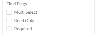
WidgetFlags allow you to define certain behaviors of a field and its associated widgets. The available flags may change over time, but these are the currently supported WidgetFlags. A WidgetFlags object can be passed to a form field at creation to define the default state of the field.
You can update WidgetFlags by accessing the WidgetFlags that have been added to the field. This can be done by calling the set method. All WidgetFlags accept a boolean value to determine the desired state.
The most consistent way to update a field's value is to call the setValue method on the field object. This will result in the field being updated along with all of the associated widgets.
Form field highlighting is enabled by default to visually indicate interactive fields in the UI. This applies to:
Text fields
Choice fields
Signature fields
Checkboxes
Radio buttons
However, highlight is not applied to push buttons. Highlighting is a UI-only visual cue and does not change the underlying widget styling or appearance.
You could choose to enable or disable the highlight with the following APIs:
The PDF specification allows multiple widgets to be associated with a single field, ensuring consistency across these widgets. For instance, a user may want to enter their first name only once and have it shown in multiple places in the form. We support this functionality by passing the same field into different widgets during object creation.
JavaScript
1function createWidget (field, options, x, y, Annotations) {
2 let newWidget = new Annotations.TextWidgetAnnotation(field, options);
You can also link widget annotations across multiple pages to a single form field. The same update behavior mentioned in the previous section applies. In the example below, we extend the createWidget function to accept a Page argument. Finally, we attach multiple cross-page widgets to a single field. This allows you to have shared fields across multiple PDF pages, streamlining data entry and ensuring that updates to one widget are automatically propagated to the other widgets that relate to the same field.
Options are only applicable to list box and combo box field types. They define the possible values a user can select when interacting with these fields.
Checkbox widgets can also have appearances like Annotations. However, some files can have appearances that don’t match their values. If the value or appearance state is set to On, then the checkbox will be checked in WebViewer.