Product:
Realtime collaboration customization (Deprecated)
You can customize the client side UI for realtime collaboration.
Realtime collaboration customization in Xamarin.Android
This tutorial only applies to Xamarin.Android.
Customize the annotation reply UI
Custom theme colors
All UI components in the real-time annotation reply interface can be customized using Android styles defined in Resources/values/styles.xml. You can extend ReplyBaseTheme.DayNight and override the inherited attributes to change the look of your reply UI. A description of each color attribute used in ReplyBaseTheme.DayNight is summarized below.
XML
then you can use this theme by specifying it in your activity's theme using the replyTheme attribute:
XML
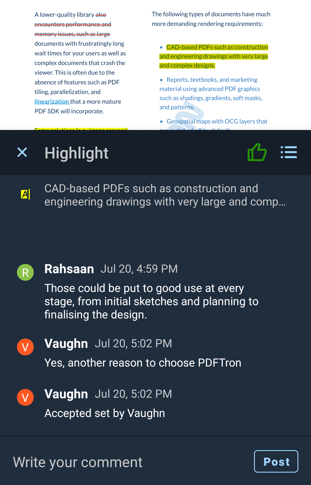
This theme will look something like this:

Annotation reply UI with a custom theme.
UI color attributes
Below is a list of all available color and size attributes used by the annotation reply UI.
Attribute | Description | Format |
|---|---|---|
| Primary background color, used by most of the reply UI | Color |
| Secondary background color, used by the header and edit message label | Color |
| Color of icon image buttons | Color |
| Color of horizontal dividers | Color |
| Color of the send message text button | Color |
| Color of the send message text button when it is disabled | Color |
| Color of the cancel editing message text button | Color |
| Main text color used in the text editor and message content | Color |
| Text color used in subheaders, annotation preview content, and caption text | Color |
| Text size of the reply messages | Dimension |
| Text size of the text editor | Dimension |
| Text size of the header | Dimension |
Custom layout attributes
Each view in the reply UI can be further customized by individually specifying its style. Default styles are used by each view, and you can extend and override them in your reply theme.
Here is a list of default styles used by each view in the reply interface.
Attribute | Description | Format |
|---|---|---|
| Style used by the reply header container | Style reference |
| Style used by the reply header close button | Style reference |
| Style used by the reply header list button | Style reference |
| Style ued by the reply header title | Style reference |
| Style used by the reply message list container | Style reference |
| Style used by each reply message's username | Style reference |
| Style used by each reply message's date stamp | Style reference |
| Style used by each replymessage's comment | Style reference |
| Style used by each reply message's action button, only shown if permission is available for current user | Style reference |
| Style used by the annotation preview text, only shown if annotation content is available | Style reference |
| Style used by the annotation preview icon | Style reference |
| Style used by the text editor container | Style reference |
| Style used by the text editor send button | Style reference |
| Style used by the text editor's EditText view | Style reference |
| Style used by the text editor cancel button, shown when editing user comments | Style reference |
| Style used by the text editor header, shown when editing user comments | Style reference |
Use a custom viewer fragment
If you would like to use a custom viewer fragment, you can extend the CollabViewerTabHostFragment2 or CollabViewerTabFragment2 class and pass in your custom classes to CollabViewerBuilder2.
C#
Did you find this helpful?
Trial setup questions?
Ask experts on DiscordNeed other help?
Contact SupportPricing or product questions?
Contact Sales