Product:
Custom Modals in WebViewer UI
WebViewer supports custom modals. There are multiple APIs to help you manage them.
To create a new custom modal, you can use the addCustomModal API. In order to create a custom modal, you need, at least, the dataElement that will be used to identify the modal, and the structural components header, body and footer.
The header element requires the following properties:
titleString, required. Used for the title of the modalclassNameString, optional. CSS class name for the header section of the modalstyleObject, optional. Inline style as an object, for example: { width: '12px', height: '23px', color: 'red' }childrenArray, optional. The parameter for passing custom DOM elements to the header section of the modal
The body components is the main section of the custom modal and it requires following properties:
titleString, optional. Used for the <p> text in body of the modalclassNameString, optional. CSS class name for the body section of the modalstyleObject, optional. Inline style as an object, for example: { width: '12px', height: '23px', color: 'red' }childrenArray, optional. The parameter for passing custom DOM elements to the body section of the modal
The footer section of the custom modal requires the following parameters:
classNameString, optional. CSS class name for the footer section of the modalstyleObject, optional. Inline style as an object, for example: { width: '12px', height: '23px', color: 'red' }childrenArray, optional. The parameter for passing custom DOM elements to the footer section of the modal
Once the custom modal is added, you can manage its visibility with these handy APIs:
Here is a code snippet that add a custom modal to WebViewer and immediately opens it:
JavaScript
For styling these components, see Customizing WebViewer UI Styles. Here is an example stylesheet file for the above code.
CSS
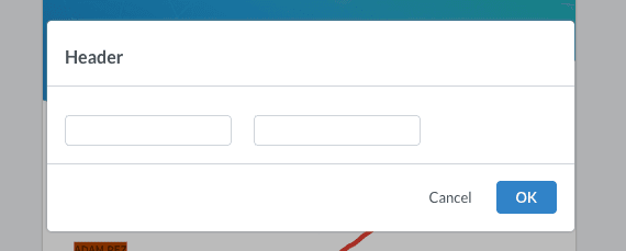
This is the output for the code above:
Did you find this helpful?
Trial setup questions?
Ask experts on DiscordNeed other help?
Contact SupportPricing or product questions?
Contact Sales