Product:
Modular UI
Legacy UI
Localization
Getting Started
WebViewer Modular UI is a new way to customize the UI of WebViewer. It provides modular and reusable components which can be used to modify the default WebViewer UI or even create an entirely new WebViewer UI from scratch.
Components
WebViewer Modular UI consists of two high-level components: Containers and Items. Everything in the UI can be categorized as one of these two things.
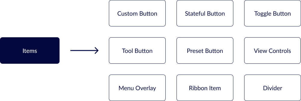
Items
Items are the components that are placed inside containers. They are the building blocks of the UI and are used to create the content of the UI. Examples of items include Buttons, Ribbon Items, Dividers, and prebuilt components like View Controls and Zoom Controls.
Containers
Containers are the top-level components that hold other components. They contain items and are used to create the structure of the UI. Examples of containers include Modular Headers, Grouped Items, and Flyout Menus.
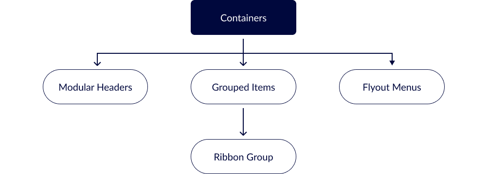
Anything that is an Item can be placed inside a Container. Containers can also be placed inside of other Containers (with some restrictions). This allows for a high level of customization and flexibility in the UI.
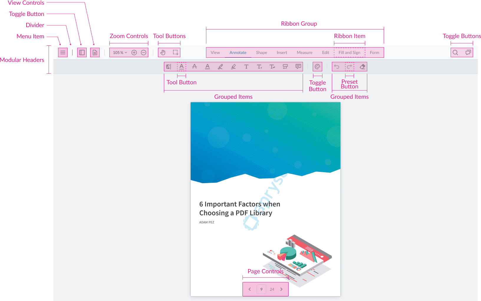
The Default UI
The following diagram shows how all the default UI components are structured in WebViewer Modular UI.
Did you find this helpful?
Trial setup questions?
Ask experts on DiscordNeed other help?
Contact SupportPricing or product questions?
Contact Sales