Product:
Modular UI
Legacy UI
Localization
Items
Overview
Items are the building blocks of WebViewer Modular UI. They are components that are placed inside containers. They include buttons and prebuilt components such as the page controls and zoom controls. All items inherit properties from the same base class and can be modified in similar ways. They can also be placed in different containers to make them easier to manage and reuse.
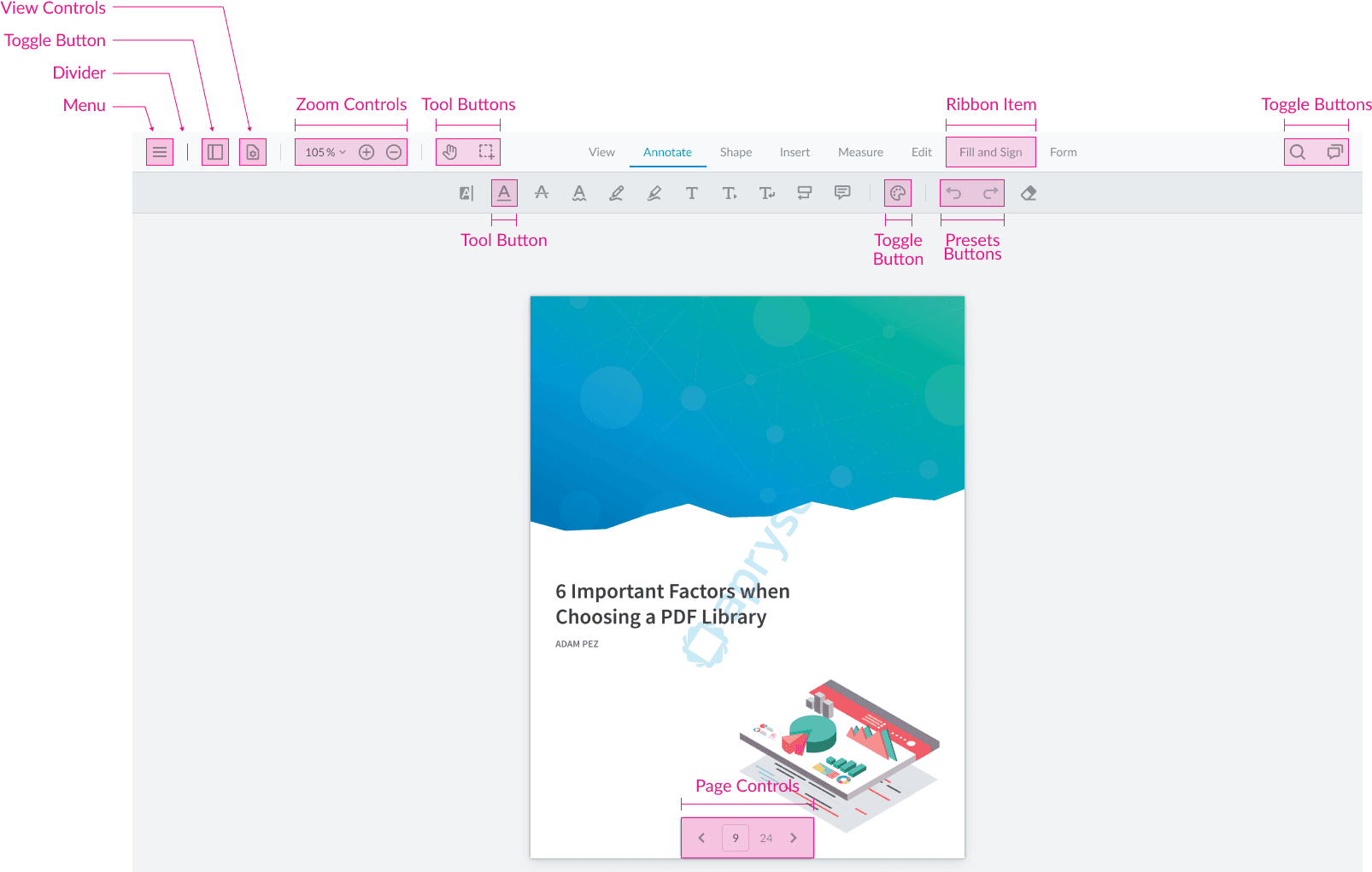
The default UI includes various item types, such as Toggle Buttons, Tool Buttons, Ribbon Items, View Controls, Zoom Controls, and Page Controls.
These items are highly customizable. A button, for example, can display a label, an icon, or both, depending on its properties. You can apply inline styles using the style property, which accepts an object where each key represents a CSS property and its corresponding value. Alternatively, the className property allows you to assign CSS classes for styling via external stylesheets.
Each item type has its section with examples demonstrating these customization options.

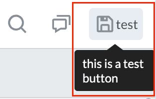
Custom Buttons
Custom buttons, also referred to as Action Buttons, allow you to specify the icon, title, and onClick behaviour. These can include any kind of function call, such as posting data to a server.
JavaScript
Using Icons
When incorporating icons into your project, you have two options: utilize custom icons by providing a local path, or select from the extensive collection included with WebViewer by specifying the icon's file name. To explore the available icons and their corresponding file names, refer to the comprehensive list here.
The code above creates a custom button which will look like this:
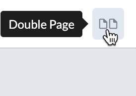
Stateful Buttons
Stateful buttons are buttons that can have a state within them. These are generally used for tools or viewing modes, where we want to change the style of the button depending on the state (e.g. active tool vs not active).
JavaScript
The code above creates a stateful button that toggles between Single Page and Double Page states and will look like this:
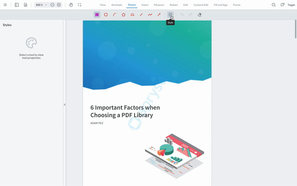
Toggle Element Buttons
Toggle Element Buttons, also known as Toggle Buttons, are buttons that can be used toggle specified elements on and off in the UI. These are generally used for opening panels, such as the Notes Panel or the Thumbnails Panel, or for activating special modes such as Form Field Editing Mode or Content Editing Mode.
JavaScript
One of the most common use cases for this type of button is to toggle the visibility of the Style Panel like so:
Tool Buttons
Tool Buttons are buttons that are used to activate a specific tool.
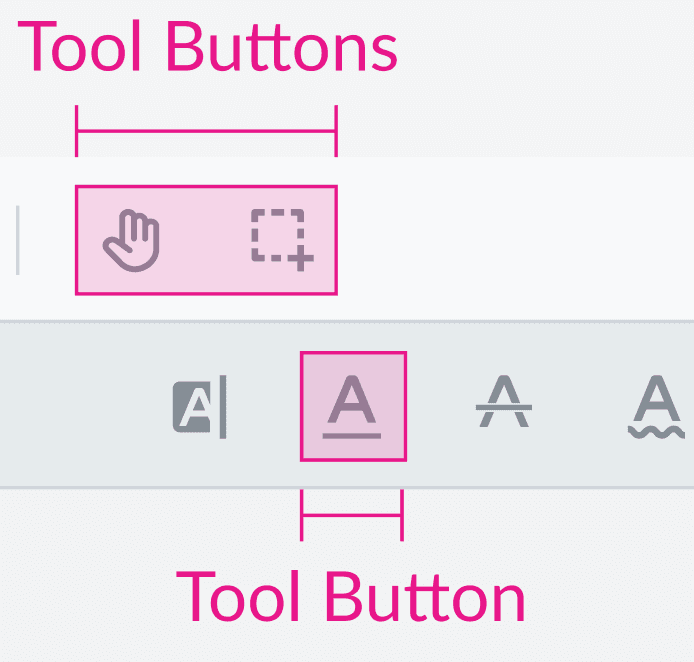
In the Modular UI, they are abstractions that can be used to easily add a tool button anywhere in the UI as shown in the example below:
JavaScript
Tool buttons can also be customized by passing in a custom img, label, title, style, or className.
See the API guide for a list of available tool names that can be used with Tool Buttons.
Using multiple instances of a tool
In the above list of tools you will find some tools have multiple instances, and use names such as RECTANGLE2, RECTANGLE3, etc. These are different instances of a tool that have different pre-set styles. If your UI requires multiple instances of the same tool as separate tool buttons, with different styles for each you can leverage these.
Ribbon Items
Ribbon Items are a special type of item that are used within a Ribbon Group to create a ribbon. They are used to set which Grouped Items should appear in the secondary header in the default UI.
For a full code sample of adding ribbon items to the UI, see the Ribbon Group documentation.
Custom Elements
Custom Element is a versatile UI component that allows you to render any React or HTML element inside WebViewer's Modular UI framework. This component is particularly useful for embedding custom components, displaying dynamic content, or integrating third-party elements within the UI.
A CustomElement instance is created by passing an object with the render function, which returns either a React element or a raw HTML element.
One limitation of this functionality is that any React component using hooks cannot be used inside the render function. For more information about this limitation and its workaround please follow this guide.
The following code sample creates a custom element that renders some text:
JavaScript
Prebuilt Items
The Modular UI features a variety of prebuilt items designed to streamline the integration of commonly used viewer functionalities. These components allow for easy placement anywhere within the viewer, eliminating the need to recreate their internal logic. Among these are the Preset Items, which are buttons engineered to handle frequent actions such as downloading documents and initiating print options. Additionally, the prebuilt items include Page Controls, Zoom Controls, and View Controls. These render components that manage the viewer's state, enabling settings adjustments for the current page, zoom level, and page orientation.
Preset Buttons
Preset buttons are buttons that are already defined in the default UI. These include buttons such as the Save Button, Print Button, and Download Button. These buttons are generally used to perform actions on the document or toggle different modes like Content Edit Mode or Form Field Creation Mode.
You can find a full list of the available preset buttons in the PresetButton class documentation.
Note: With Modular UI, you cannot use updateElement API to override or change the behaviour of a preset button. Please use a CustomButton instead.
The following code creates a new Preset Save Button:
JavaScript
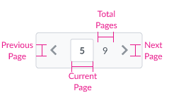
Page Controls
Page Controls are used to navigate through the pages of a document. They include a page number input which shows the current page along with the total pages and buttons to move to the previous page and the next page in the document.
Page Controls can be placed inside containers and customized to match your application’s design. The className property allows you to assign custom CSS classes, enabling targeted styling and further customization through external stylesheets. However, the style property is not supported for this component, so inline styles cannot be applied directly.
The following code creates a new Page Controls item:
JavaScript
Adding a Page Controls item to a vertical container like a left-placed Modular Header, will set the Page Controls to be vertical as well.
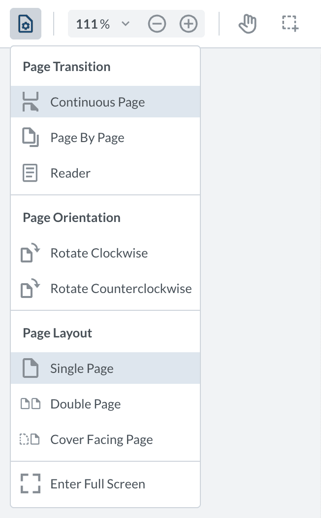
View Controls
View Controls in WebViewer let you adjust the display settings of a document. These settings include options to change how you navigate through the document (like scrolling continuously or flipping page by page), rotate the document, choose the document layout (such as viewing one page at a time or two pages side-by-side), and a button to view the document in full screen.
This component gets added to the UI as a toggle button which can be used to show or hide the View Controls Flyout Menu.
The following code creates a new View Controls item:
JavaScript
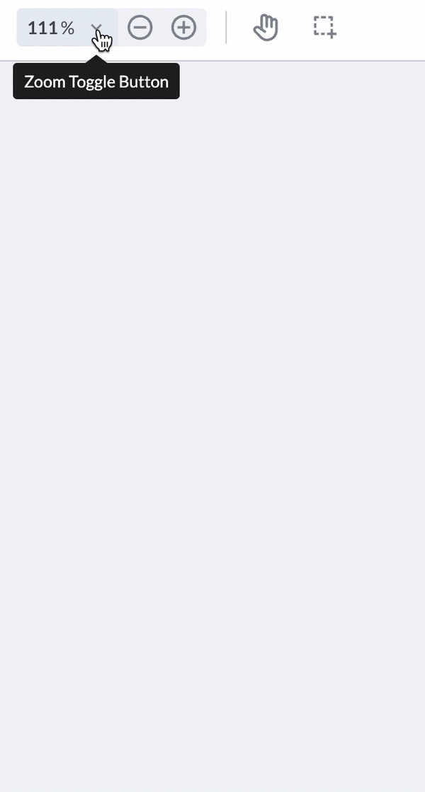
Zoom
The Zoom component is used to change the zoom level of the document. It includes buttons to zoom in and zoom out and an input field to manually change the zoom level. There is also a dropdown button that opens a Zoom Flyout Menu which contains a list of preset zoom levels as well as Fit To Width and Fit To Page buttons and a button to activate marquee zooming (changing the zoom level by clicking or cmd/ctrl+clicking).
The Zoom component can be customized using the className property, which allows you to apply custom styles through an external stylesheet. This enables greater flexibility in adapting the component’s appearance to match your application's design.
The following code creates a new Zoom item:
JavaScript
setStyle API
All of the modular components listed above that support the style property also provide access to the setStyle API. This allows you to dynamically update the component’s styles. To use it, retrieve the item from the header where it is located and call setStyle, passing an object that defines the inline CSS styles.
JavaScript
Using Pseudo-classes
If you wish to add pseudo-classes to any of the elements in the modular UI, you must use a custom stylesheet. This is because the setStyle API uses inline style objects, which do not support pseudo-classes.
For example, if you wish to add a hover to the RibbonItems, you can define that in a custom stylesheet. To find the class name for each component you can inspect the DOM. If you are constructing the elements from scratch you can also define your own class names.
Ribbon Item with className
And then you must add a custom stylesheet.
Ribbon Item Custom StyleSheet
Did you find this helpful?
Trial setup questions?
Ask experts on DiscordNeed other help?
Contact SupportPricing or product questions?
Contact Sales