Product:
Modular UI
Legacy UI
Localization
UI Import and Export
With the WebViewer Modular UI, it is possible to import and export an entire UI configuration using JSON.
This provides a simple and efficient way to customize the Webviewer UI whether starting from the out-of-the-box UI or assembling something new using modular components. A configuration can be saved as a separate file or worked on as an object to make customization and editing easier with all the different components available in one place.
A configuration can contain:
- Modular Components (ie., Items, Grouped Items, and Ribbon Groups)
- Modular Headers
- Flyouts
- Panels
- Popups
Import a Modular UI
To use a Modular UI configuration, it needs to be imported into WebViewer. The configuration can be imported using the UI.importModularComponents method. The method takes a configuration JSON object as a parameter along with an optional function map.
JavaScript
The import method will validate the configuration to ensure that it is correctly formatted and that all Modular Components, Modular Headers, Flyouts, Panels, and Popups have their necessary properties. If any errors are found, an error message will display in the console and the import operation will be aborted.
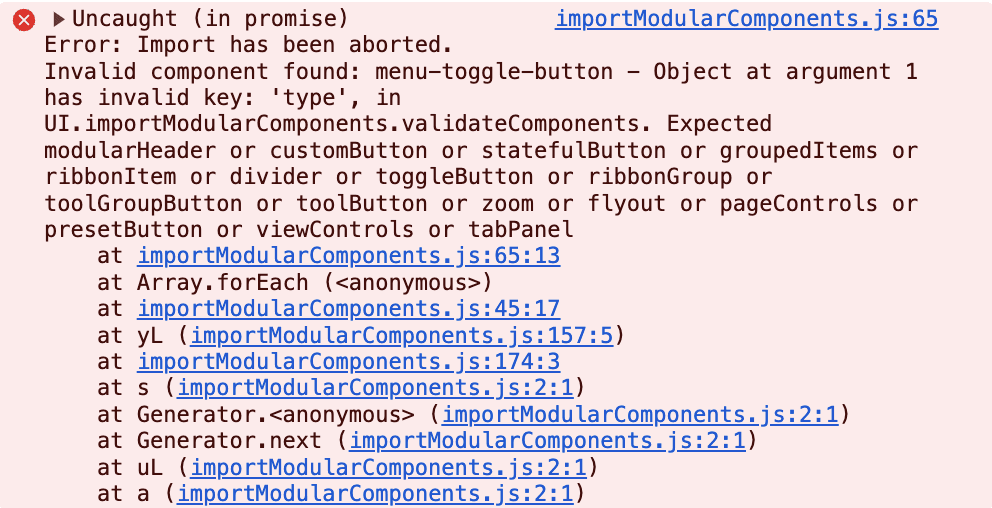
In the example above, there is an error thrown which shows that a component menu-toggle-button has an invalid key type and explains which type properties are valid.
Add a Function Map
Functions cannot be imported and exported via JSON, but a function map can be used to define functions like onClick for components such as Custom Buttons or render for Custom Elements or Custom Panels. The function map is kept separately from the Modular UI configuration. It needs to contain all functions that are used by custom components as they cannot be exported along with the other components in a JSON format.
The function map should contain one object with keys to denote the name of the function and the value as the function itself as shown below:
JavaScript
You can then refer to functions in the function map by their key in modularComponents. For example, the alertClick function key can be added to a Custom Button and the render functions can be added to a Custom Element and Custom Panel as shown below:
JavaScript
The function map can be added by importing it along with the UI configuration:
JavaScript
Importing with a Function Map
The function map should always be reimported along with its associated configuration.
Initialize with a UI Config File
If you have a configuration JSON file that you want your WebViewer UI to initialize with, you can add the uiConfig option to your WebViewer constructor with the path to your file:
JavaScript
Important: Whitelisting Required for Custom UI Configurations
To enhance security, any remote or custom uiConfig file must originate from a whitelisted domain.
You must add the origin (e.g., https://yourdomain.com) of your custom uiConfig to the configorigin.txt file in your deployment.
If the origin is not listed in configorigin.txt, WebViewer will block loading the configuration and the default UI will be initialized instead.
For more information, see our config file article.
Export a Modular UI
A Modular UI configuration can be exported from WebViewer using the UI.exportModularComponents method. The method will return a JSON object containing all the Modular Components, Headers, Flyouts, Panels, and Popups that have been added to the UI.
JavaScript
Exporting Functions
Since functions can't be stored in JSON, only the function key will be exported. Read more about creating and maintaining your function map here.
When exporting a Modular UI configuration, a JSON object will be returned. The JSON object can then be copied or saved to a file for viewing and editing.
Components are validated upon export and must include an object key to be exported successfully. Any validation warnings will be printed to the console.
If there are any functions that are referred to by components in the Modular UI and they are not included in a function map, they will be printed in a console warning:
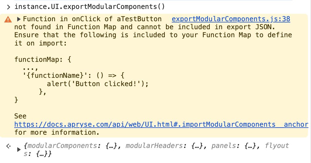
The function can then be copied and added to the function map when importing the configuration.
Import/Export Differences
Sometimes, an exported config will look different from an imported configuration. Usually this is because the exported configuration arranges all the object properties alphabetically instead of in the order that they were in the imported configuration. You might also notice that additional sections or elements are added, such as popups, even if you didn't include them in your imported configuration. This happens because those elements are included by default in the UI. You do not need to add them in your own import configs as they get added by default when the Modular UI is processed, but you can edit them in your import config.
Modular UI Configuration Structure
A Modular UI configuration is a JSON object that contains all the components that are used to build a UI. The configuration can contain the following properties:
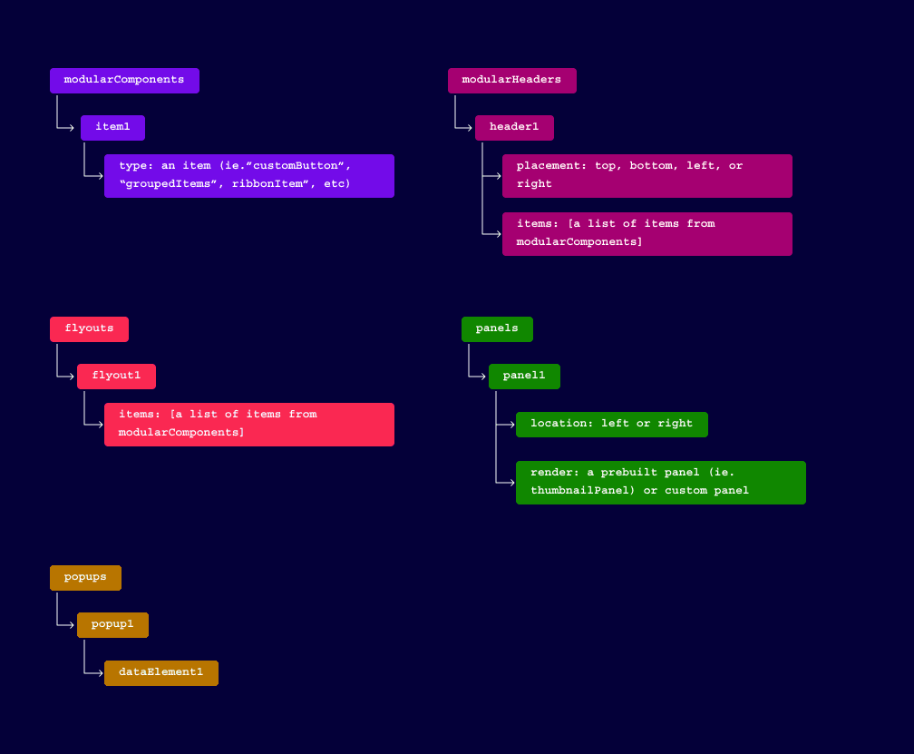
The above properties can be reordered in any way that is convenient for you. Each property can contain multiple objects with each object representing a component that is used in the UI.
To define each component and its properties within the top-level objects of the configuration structure, they should be given an object key which will be used as the dataElement of the component. The dataElement is a unique identifier used to refer to the component in the UI.
JavaScript
Modular Components
Modular Components can be added to a UI configuration by adding a modularComponents property with all components as child objects. Modular Components refer to any items or containers that can be added to a Modular Header or a Flyout. A valid Modular Component in the configuration needs to include an object key unique to that component which will be used as its dataElement.
Modular components also need to contain a type property so that WebViewer knows which kind of component it needs to create. The type property can be any of the item types normally added to a Modular Header or Flyout. More detail in the list of item types - api definitions.
To add components to the UI, their object keys (dataElement) need to be included in the items property of a Modular Header or Flyout. Since Flyouts support a nested structure, items can also be included in the children property to create a nested Flyout.
Modular Components should be added to the configuration as shown below. In this example, a Button component is added to the configuration with a dataElement of myButton and a label of My Button. It also calls an onClick function of alertClick when clicked. The logic for alertClick is stored in the function map and only referenced in the configuration JSON.
JavaScript
For more information on items which can be used in Modular Components, refer to the Items and Containers documentation.
Modular Headers
Modular Headers can be easily created by adding a modularHeaders property with each header listed as a child object to your UI configuration.
Each header can have an items property which should contain an array of dataElements of the components to be added to the header. The items contained in a header all need to be valid and included in the modularComponents section of the modular UI configuration in order to be used.
There also needs to be a placement property that specifies where the header should be placed in the UI. The placement property can be any of the following values: top, left, right, or bottom.
Modular headers can also include any of the container properties used to customize how they appear in your UI.
Modular Headers should be added to the configuration as shown below. In this example, a Modular Header is added to the configuration JSON with a dataElement of myHeader and a placement of top. The items property contains an array with the dataElement of the Button component that was added earlier.
JavaScript
For more information on Modular Headers, refer to the Modular Headers documentation.
Flyouts
Flyouts are menus which are toggled by a component (ie. a Toggle Element Button) and can be added to the JSON by adding a flyouts property.
Flyouts can contain items similarly to headers but in the case of a Flyout, the items can also be used to create submenus when they have a children property which contains other items. The items property should contain an array of dataElements of the components to be added to the first level of the Flyout.
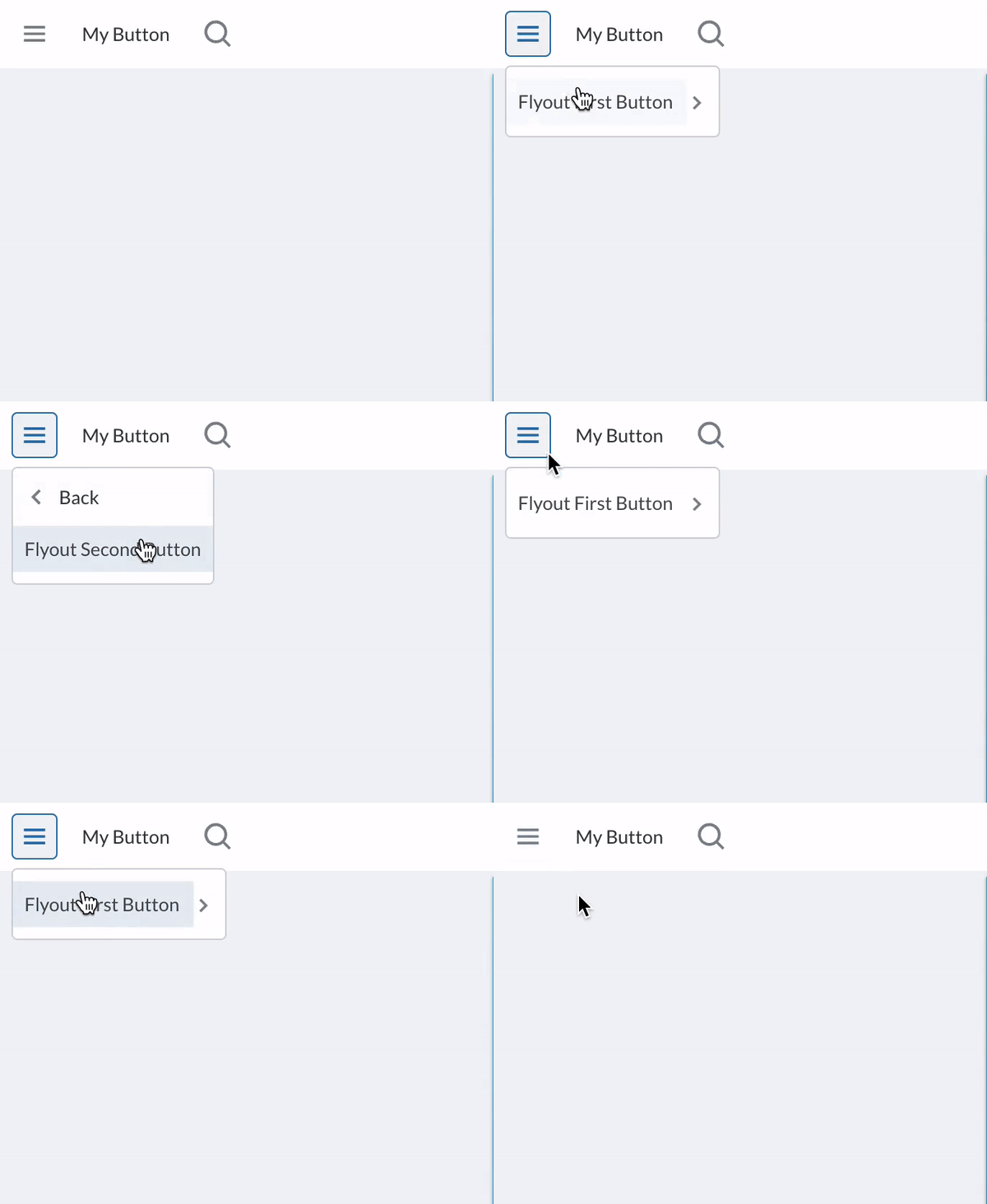
The example below shows how to create a simple Modular UI configuration which includes a header that contains a Toggle Element Button to open a Flyout. The Flyout contains a Custom Button which has a children property that contains another Custom Button which is opened as a submenu.
JavaScript
Default Navigation
Chevrons to denote that an item has children are added automatically. Back buttons are also added automatically to help with Flyout navigation.
ViewControls
Starting in version 11.11, the ViewControlsFlyout is automatically included in Modular UI configurations by default, similar to how popups are handled.
The ViewControlsFlyout is the menu that opens when clicking the view controls button in the header, providing options for changing page display modes and layouts.
If the ViewControlsFlyoutis not explicitly defined in the configuration, it will still be applied to the UI using its default settings.
When the configuration is exported, the ViewControlsFlyoutwill appear in the exported configuration even if it was not explicitly defined in the original configuration.
Panels
Panels can be included by adding a panels property with each panel listed as a child object in the configuration.
Panels need to include a location property that specifies where the panel should be placed in the UI. The location property can be either left or right.
They must also include a render property that specifies which Panel to render. The render property can include a prebuilt panel name, a custom panel with a function name that is referred to in a function map or it can be tabPanel which allows you to create a Tabbed Panel.
The following example shows how to add a panel that is rendered as a Search Panel to a Modular UI configuration.
JavaScript
The next example shows how to create a Modular UI configuration that includes a Tabbed Panel similar to the one in the Default UI.
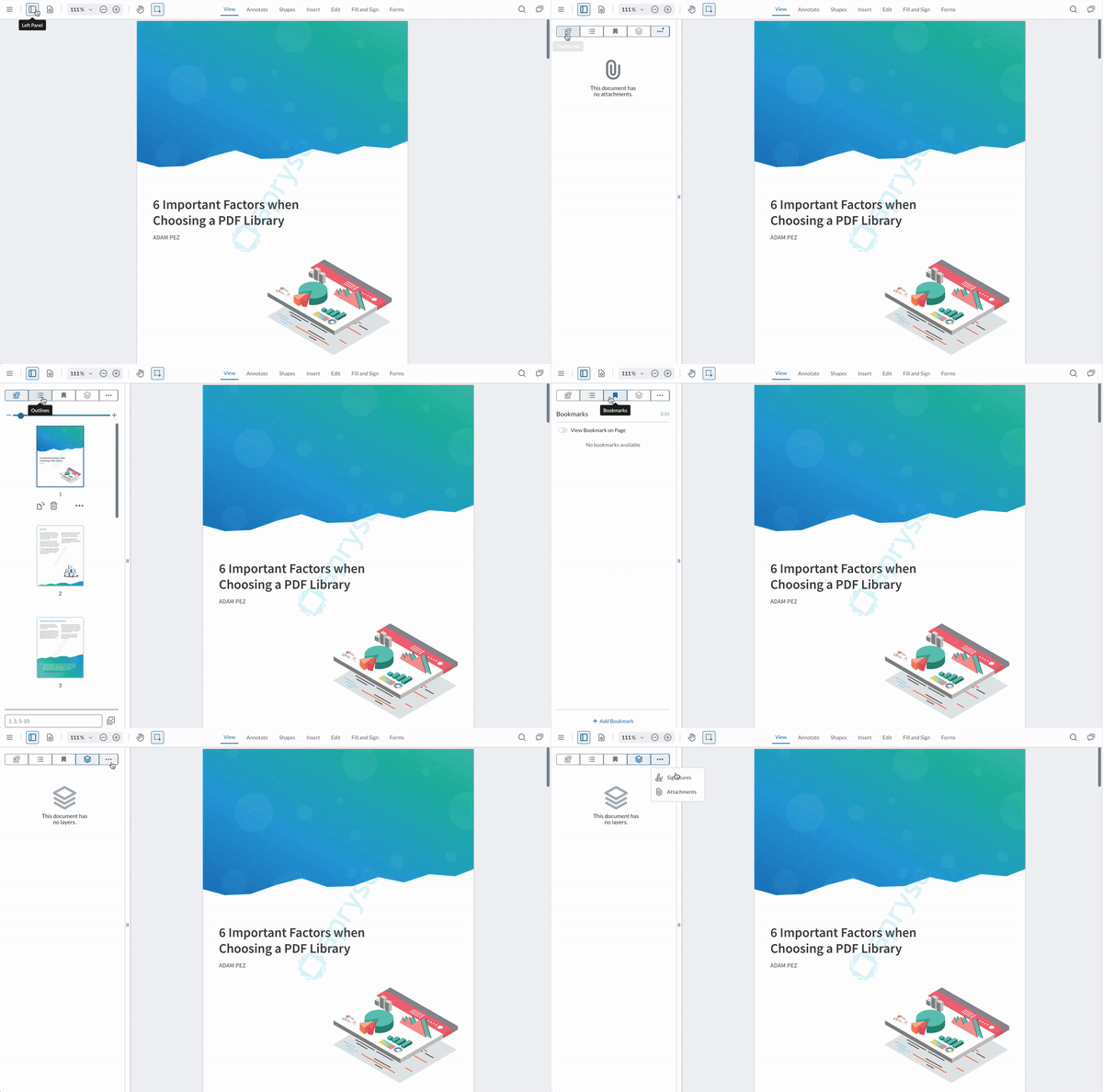
JavaScript
Popups
Starting in version 11.8, Popups are also included in Modular UI configurations. There are three popups that are included in the Modular UI by default:
- The
annotationPopupwhich opens when annotations are selected. - The
textPopupwhich opens when text in a document is selected. - The
contextMenuPopupwhich opens when right-clicking in the document viewer.
The following example shows how the default popups appear in a config file:
JavaScript 11.8+
The Popup section is optional and can be omitted from a configuration.
If a default popup is not explicitly defined in the configuration, it will still be applied to the UI using its default settings. When the configuration is exported, these default popups will appear in the exported configuration even if they were not explicitly defined in the original configuration.
Each popup can be customized by adding, removing, or reordering items in its array.
Since popup items are defined as array entries rather than keyed objects, each item must explicitly define a dataElement.
If a Popup's array is empty, it will not appear in the UI.
In this example:
- The
annotationPopupis customized by removing specific items. - The
textPopupis disabled by providing an empty array. - The
contextMenuPopupis omitted from the configuration, so it remains unchanged and will be exported with its default configuration.
JavaScript 11.8+
Refer to this guide for more information on customizing Popups.
Examples
Basic Modular UI Example
The following example shows how to create a basic Modular UI configuration. It includes a Custom Button, a Custom Header, a Panel, and a Flyout with a submenu. The configuration JSON object is then imported into WebViewer along with a function map that contains functions for the Custom Buttons. Here the popups are left in their default state and can be edited by adding or removing items from them.
JavaScript
Working with the Default UI
The following example was build using an export of the Default UI as a base.
It has been customized by editing the default ribbon to only contain the View and Annotate ribbon items, and adding the page navigation buttons to the top header.
It also has some reordered tools in the Annotate ribbon group which will now open on the left side of the UI instead of at the top underneath the default header. The Style Panel’s location has changed to open on the right instead of the left as well.
The main menu flyout was also customized to include only the Open File and Save As buttons.
Finally, the Popups were simplified to only include the Annotation Popup which opens when you click on an annotation. It has the Comment, Style, Link, and Delete buttons. The Text Popup was left empty so it will not appear. The Context Menu Popup was left out of the config. This means that it will be used as is and still work when right clicking in the document viewer.
Note: although the Context Menu Popup is not in the import, it will appear when the config is exported.
There is no need to include a function map in this example as no custom functions are used in the configuration.
See the comments in the code snippet below to understand how the configuration was built.
JavaScript
Did you find this helpful?
Trial setup questions?
Ask experts on DiscordNeed other help?
Contact SupportPricing or product questions?
Contact Sales