Migrating to V11 Modular UI

Overview and Philosophy

In WebViewer 11, the default UI has been changed to the new Modular UI. This new UI is more flexible and allows for more customization.

The previous UI is still available and can be used by setting the ui option to legacy in the WebViewer constructor.

JavaScript

1WebViewerConstructor(
2 {
3 path: '/path/to/your/webviewer',
4 initialDoc: '/path/to/your/document.pdf',
5 ui: 'legacy',
6 },
7 document.getElementById('viewer')
8).then(instance => {
9
10});

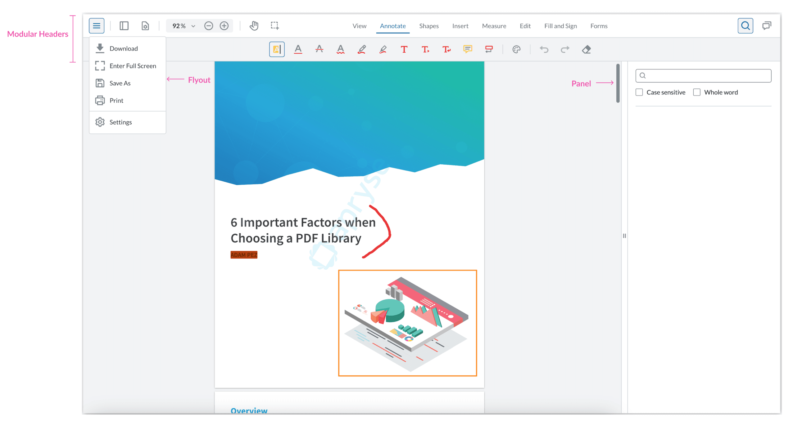
With the Modular UI, you can now easily customize your UI by adding and remove components, or alternatively building your own UI from scratch.

One of the main changes in the Modular UI is that you are able to import only the necessary components for your UI, instead of loading them all and disabling the ones you don't need.
Apryse Docs Image

This can be done using a JSON config file in which you can define the Modular Components (ie. Buttons, Ribbon Items, Grouped Items), Modular Headers, Flyouts, and Panels that you want to use and then importing it into the UI.

JavaScript

1Webviewer.WebComponent(
2 {
3 path: '/path/to/your/webviewer',
4 initialDoc: '/path/to/your/document.pdf',
5 },
6 viewerElement
7).then((instance) => {
8 const configUI = {
9 "modularComponents": {
10 "myButton": {
11 "type": "customButton",
12 "dataElement": "myButton",
13 "label": "My Button",
14 "onClick": "alertClick"
15 },
16 "flyoutToggle": {
17 "type": "toggleButton",
18 "img": "ic-hamburger-menu",
19 "dataElement": "flyoutToggle",
20 "toggleElement": "myFlyout"
21 },
22 "flyoutFirstButton": {
23 "type": "customButton",
24 "dataElement": "flyoutFirstButton",
25 "label": "Flyout First Button",
26 "children": [
27 "flyoutSecondButton"
28 ]
29 },
30 "flyoutSecondButton": {
31 "type": "customButton",
32 "dataElement": "flyoutSecondButton",
33 "label": "Flyout Second Button",
34 "onClick": "flyoutSecondButtonOnClick"
35 },
36 "searchPanelToggle": {
37 "type": "toggleButton",
38 "img": "icon-header-search",
39 "dataElement": "searchPanelToggle",
40 "toggleElement": "myPanel"
41 }
42 },
43 "modularHeaders": {
44 "myHeader": {
45 "dataElement": "myHeader",
46 "placement": "top",
47 "items": [
48 "flyoutToggle",
49 "myButton",
50 "searchPanelToggle"
51 ]
52 }
53 },
54 "panels": {
55 "myPanel": {
56 "dataElement": "myPanel",
57 "location": "left",
58 "render": "searchPanel"
59 }
60 },
61 "flyouts": {
62 "myFlyout": {
63 "dataElement": "myFlyout",
64 "items": [
65 "flyoutFirstButton"
66 ]
67 }
68 }
69 };
70
71 const functionMap = {
72 'alertClick': () => alert('Alert triggered!'),
73 'flyoutSecondButtonOnClick': () => {
74 console.log('Second Item clicked!');
75 },
76 };
77
78 instance.UI.importModularComponents(configUI, functionMap);
79});

In the example above, a functionMap is also used to define the onClick functions for the buttons.

This new way of customizing the WebViewer UI is more flexible and allows for more control over the UI components that are used.

Along with importing UI configs, there is also the new ability to export a UI config using the UI.exportModularComponents API. This can be useful if you want to save a UI configuration to use in another instance of WebViewer.

JavaScript

1const exportedUI = instance.UI.exportModularComponents();
2console.log(exportedUI);

Modular UI Equivalents for Existing APIs

Because of the change to the new UI, there are now different APIs for interacting with and customizing the WebViewer UI.

The table below summarizes how a few of the existing APIs have changed in the Modular UI:

Existing API

Matching API in Modular UI

setToolBarGroup()


New Modular API, also has a matching getter to see which ribbon item is currently active, getActiveRibbonItem()

setHeaderItems()


New Modular APIs to return a header object, which has methods on it to set items and properties. These update dynamically in the UI. See ModularHeader Class.

setActiveHeaderGroup()


Changing headers can be done simply by adding a new header or by changing out the entire list of headers with a new one. See ModularHeader Class.

setCustomPanel()

  • addPanel - allows users to add a standalone panel to the left or right, using custom code or the existing preset panels
  • getPanels - returns all panels
  • setPanels - sets all panels


The legacy API only allows you to add a tab to the left panel. With the new APIs, you can set custom or existing panels to the left or right. If you want to add a tab to a tabbed panel (i.e., the default leftPanel), you can get the TabPanel with getPanels and add a tab to its `panelsList`.

MenuOverlay Class
This class implements three methods to customize the hamburger menu:

  • getItems
  • add
  • update


This uses the new Flyout class, which has the following methods and properties:

  • setItems
  • items property
  • Option to instantiate with an array of items


All existing legacy methods work with new Flyout.

PageManipulation Overlay
Has access to methods to update and set the items in the page manipulation overlay (opened via thumbnails)

  • getItems
  • add
  • update


Also has two methods to customize onClick behaviors:

  • disableOpeningByRightClick
  • enableOpeningByRightClick


These APIs control if we can open this overlay with a right click.

PageManipulation Overlay is now a Flyout with the same methods as the legacy overlay. It also has access to all methods and properties of the new Flyout class.

All existing legacy methods work with new Flyout.

Examples

Below are some examples of how to use the new Modular UI APIs to customize the UI.

Changing Header Items

Before

You would use the API UI.setHeaderItems to change the header items or the API UI.setActiveHeaderGroup to manipulate the header.

After

There are now different ways that headers can be used in the Modular UI. You can now have multiple headers in different places in your UI. As such, there are now getters such as UI.getModularHeader and UI.getModularHeaderList which return header object that include methods to set items and properties. When headers are changed they will be updated dynamically in the UI.

You can also add new headers or change the current list of headers with the APIs UI.addModularHeaders and UI.setModularHeaders.

The following example shows how to change the items in a header:

JavaScript

1const header = instance.UI.getModularHeader('default-top-header');
2// replace all items in the default top header with a new button
3header.setItems([{
4 type: 'customButton',
5 dataElement: 'testButton',
6 label: 'My Button',
7 title: 'My Button',
8 onClick: () => {
9 console.log('Button clicked');
10 }
11}]);

Editing the Main Menu

Before

You would use the settingsMenuOverlay interface to customize the hamburger menu.

After

You can now use the new Flyout class, which has the setItems method that you can use to change the items in the flyout. To find the flyout you want to change, you can use the getFlyout method.

JavaScript

1instance.UI.Flyouts.getFlyout('MainMenuFlyout').setItems([
2 {
3 type: 'customButton',
4 className:"row",
5 img: 'icon-header-print-line',
6 onClick: () => {
7 alert('Hello world!');
8 },
9 dataElement: 'alertButton',
10 label:'test button',
11 role:"option"
12 },
13 {
14 type: 'customButton',
15 className:"row",
16 img: 'icon-header-print-line',
17 onClick: () => {
18 alert('Hello world!');
19 },
20 dataElement: 'alertButton2',
21 label:'test button 2',
22 role:"option"
23 },
24]);

Moving Items into a Header

Before

In order to move items from the Main Menu to the header, it would require a lot of custom code. You would need to create a custom button for each one that you wanted to move and add that button to the header. Creating the custom button would also mean finding the APIs to call from the button's onClick method and whichever icon you wanted to use.

After

With the new Modular UI, you can easily move items from the main menu to the header by using preset buttons along with the setItems methods, shown above, for the main menu and header.

JavaScript

1// Download button from the Main Menu
2const downloadButton = new instance.UI.Components.PresetButton({
3 buttonType: 'downloadButton',
4 dataElement: 'presetButton-download'
5});
6
7// Save As button from the Main Menu
8const saveAsButton = new instance.UI.Components.PresetButton({
9 buttonType: 'saveAsButton',
10 dataElement: 'presetButton-save'
11});
12
13// Print button from the Main Menu
14const printButton = new instance.UI.Components.PresetButton({
15 buttonType: 'printButton',
16 dataElement: 'presetButton-print'
17});
18
19// Settings button from the Main Menu
20const settingsButton = new instance.UI.Components.PresetButton({
21 buttonType: 'settingsButton',
22 dataElement: 'presetButton-settings'
23});
24
25const header = instance.UI.getModularHeader('default-top-header');
26
27// add all the buttons to the header
28header.setItems([...header.getItems(), downloadButton, saveAsButton, printButton, settingsButton]);

Preset buttons are a new feature in the Modular UI that allow you to easily add buttons to the UI without having to create custom buttons. They are a great way to add buttons to the UI that already have an icon the correct onClick methods.

You can even add other prebuilt items like the Page Controls to the header in the same way.

JavaScript

1const pageControls = new instance.UI.Components.PageControls();
2
3// This can now be added to a modular header
4const header = instance.UI.getModularHeader('default-top-header')
5header.setItems([...header.getItems(), pageControls]);

You can also find some examples that show how to set up a UI config in the UI Import and Export guide.

Did you find this helpful?

Trial setup questions?

Ask experts on Discord

Need other help?

Contact Support

Pricing or product questions?

Contact Sales