Product:
Build PDF forms using Javascript in WebViewer 11
WebViewer 11
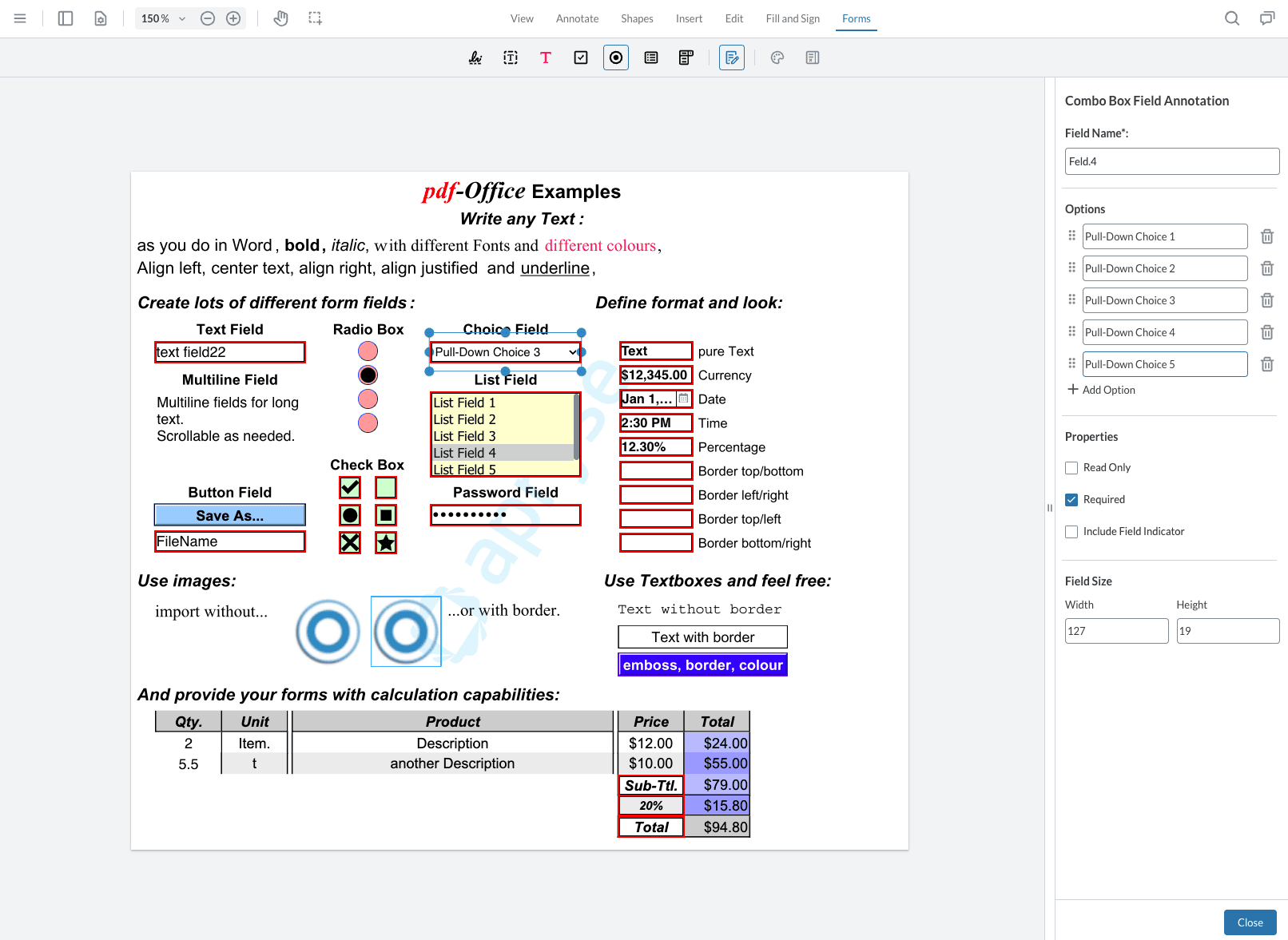
Starting in WebViewer 11, you can build and edit forms with our new modular UI panels. You can also preview the form fields in real-time while in form builder mode as placeholder annotations have been removed. The removal of placeholders means all placeholder APIs have been deprecated, so make sure to review the WebViewer 11 Migration Guide.
Editing Fields
In WebViewer 11, all annotations remain visible in form builder mode. Placeholders are no longer supported, meaning fields won’t be converted when switching modes. If any of your form fields have a transparent border and fill they may not be visible in form builder mode. To view all your form fields, you can use the form field list panel or notes panel (available only with modular UI) to see a complete list of fields in the document.
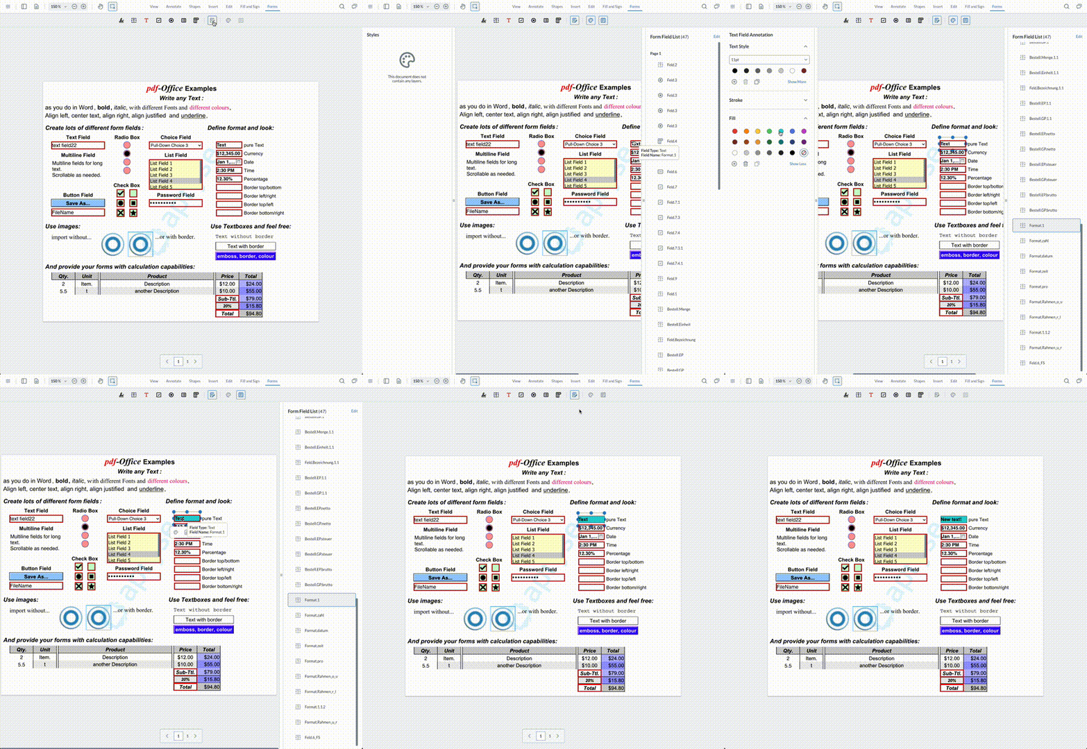
To view or change the properties for each widget click on the annotation and open the form field properties panel. The panel will update depending on the selected field. Updates are made automatically as you change them - no need to click Close to confirm any changes.
Text Fields
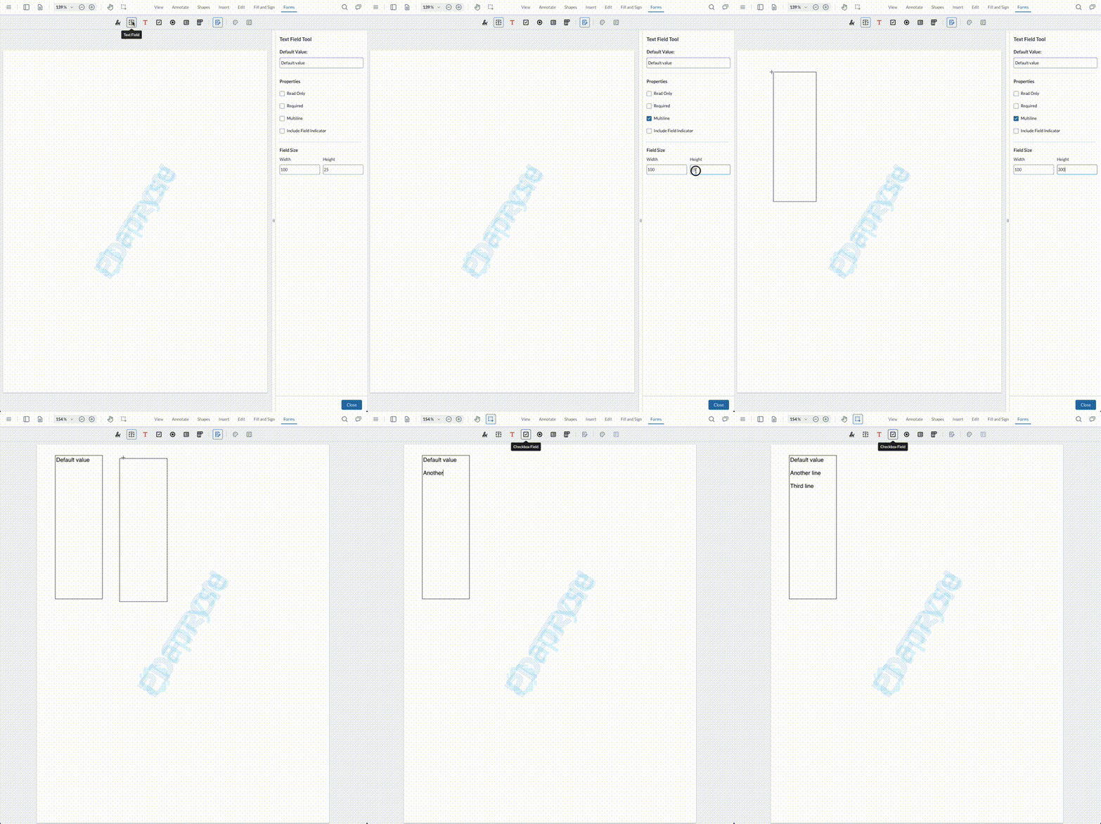
Text fields can have a default value, as well as support for multi-line via field flags.
Signature Fields
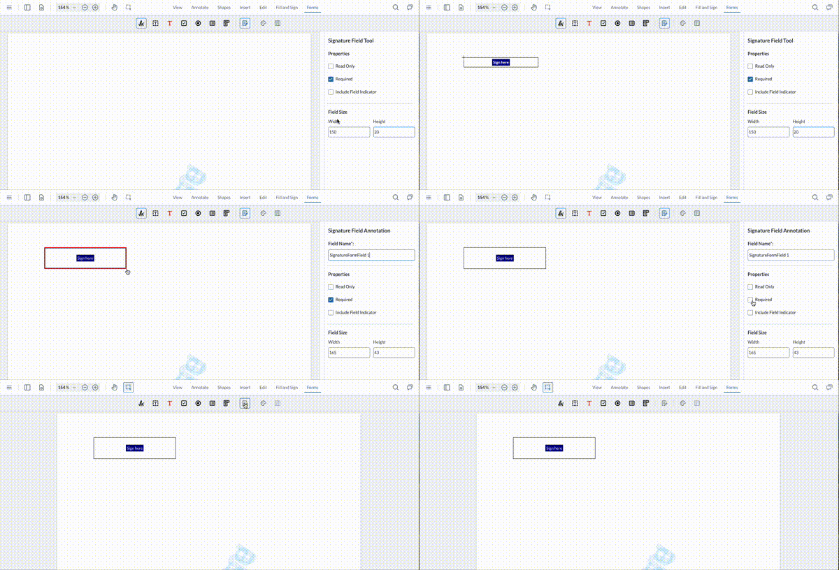
Signature fields can be created to accept signatures or initials. Choose the required option in the dropdown. Please note that the initials feature must be enabled in order for this option to be displayed. For a sample on how to do this refer to this guide.
Signature widgets that are flagged as requiring initials will apply initials created by the user in the signature modal during the signing process.
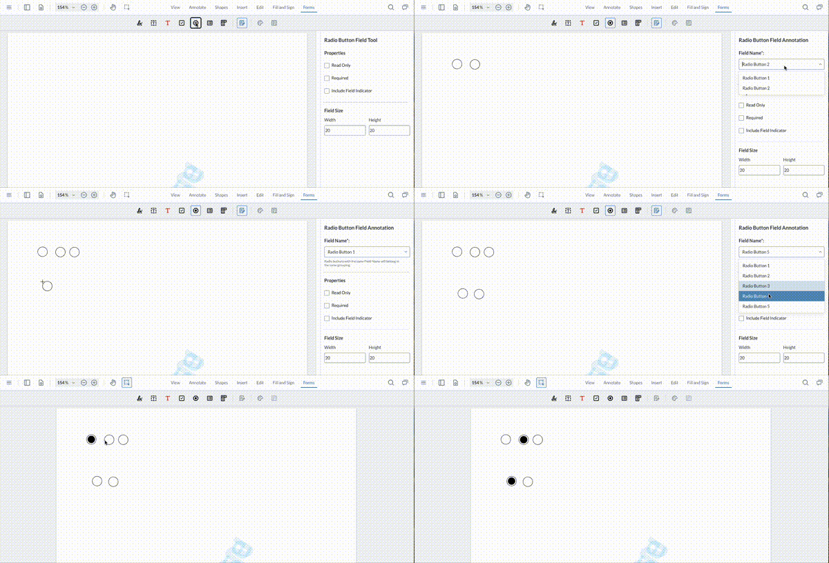
Radio Fields
To logically group radio buttons together ensure they share the same field name.
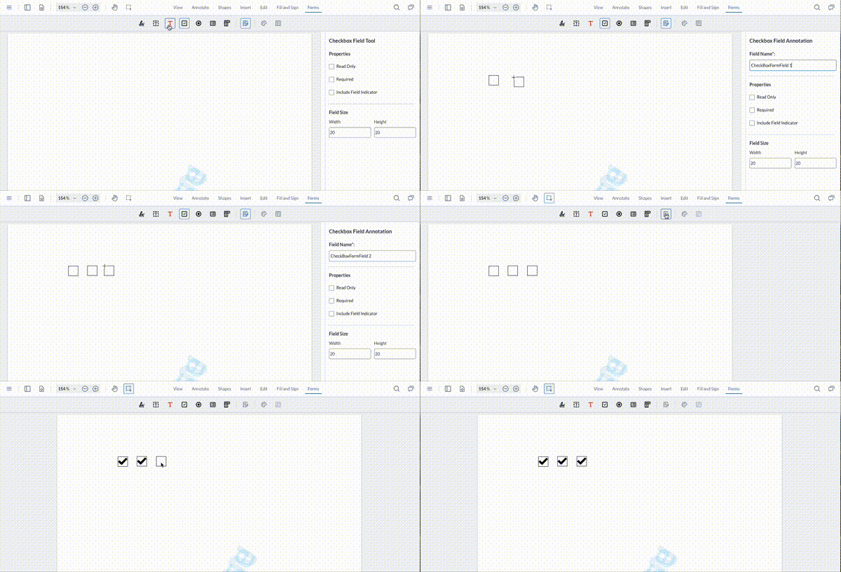
Check Box Field
Check boxes support two field flags: required and read only.
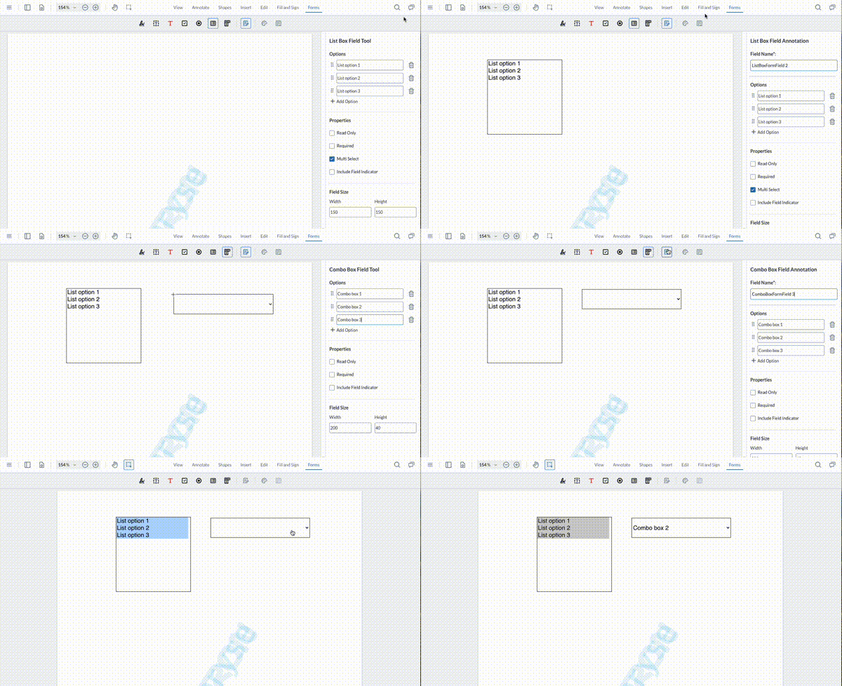
List and Combo Box Fields
For list and combo box fields you can add as many options as you wish, and re-order them as needed. List box fields also have support for multi-selection if this flag is enabled.
Did you find this helpful?
Trial setup questions?
Ask experts on DiscordNeed other help?
Contact SupportPricing or product questions?
Contact Sales