Product:
Build PDF forms using Javascript in WebViewer 8
WebViewer 8
Starting in WebViewer 8, you can build and edit forms fields with an interactive form builder that is part of the UI. This form builder mode allows users to add new form fields, and edit existing fields by changing field names, required flags, as well as their size and position in the document. Users are also able to delete form fields. The FormFieldCreationManager also offers several APIs and events that allow developers to run custom logic.
Click Forms in the header, which will activate form building mode.
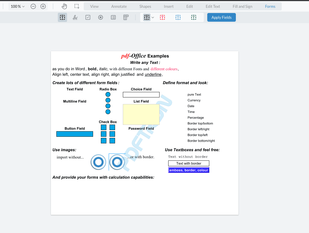
Editing Fields
While in this mode, all non-field annotations will be hidden. All existing form fields will be converted into annotations that will serve as placeholders for the actual fields. Any styles currently used by the form field will be carried on to its placeholder, with the exception of radio buttons or signature widgets which do not support styling. This means that if any of your form fields have a transparent border and fill, they will not be immediately visible while in form builder mode. In order to view all your form fields, you can open the notes panel to see all the fields present in the document.
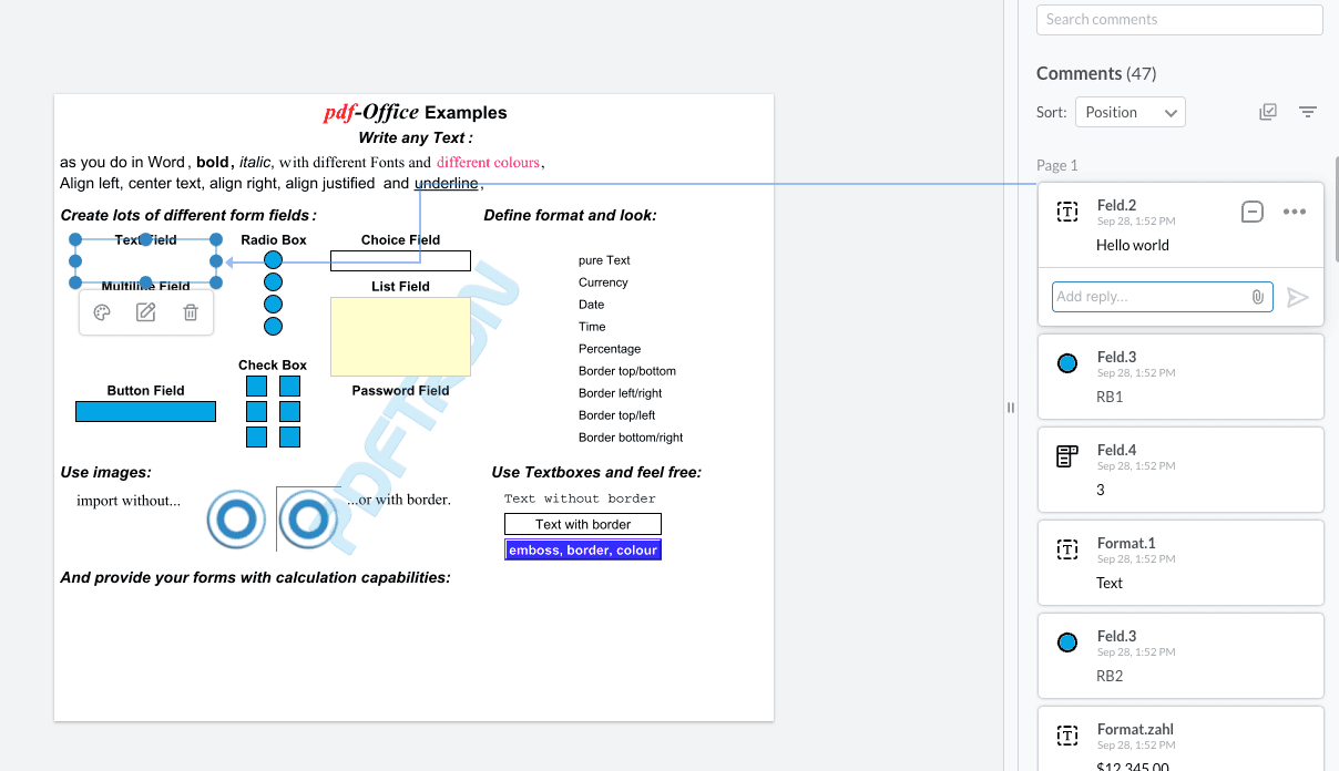
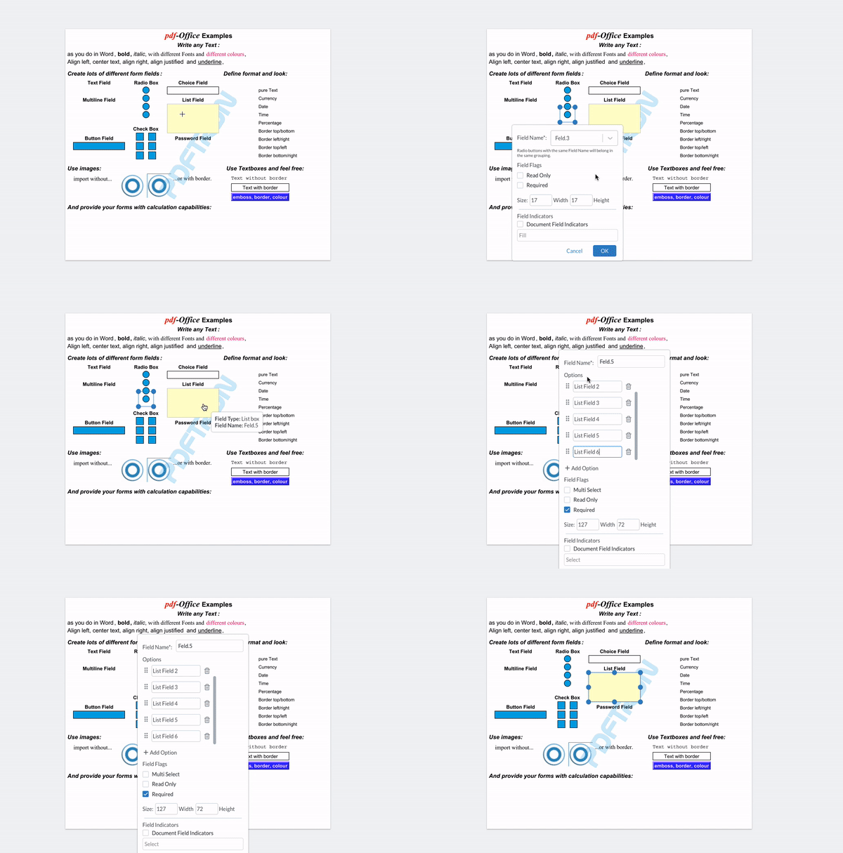
In order to view or change the field information for each field, click on the annotation place holder and open the form field edit popup. The popup options will change depending on the type of field being edited.
Click Apply Fields to finish editing and apply changes to the fields.
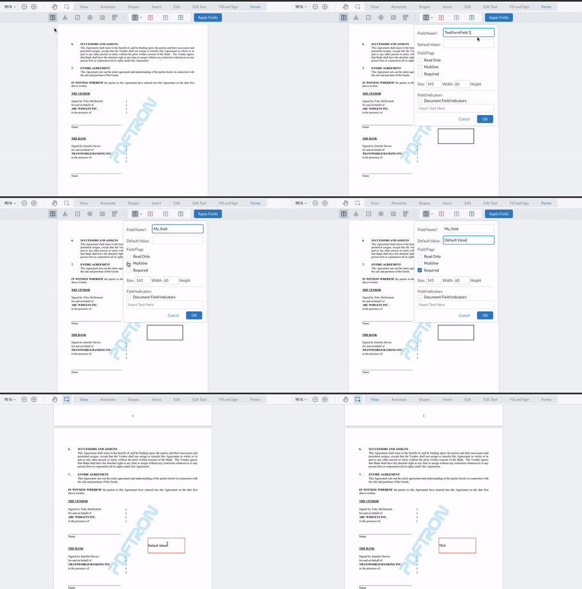
Text Fields
Text fields can have a default value, as well as support for multi-line via field flags.
Signature Fields
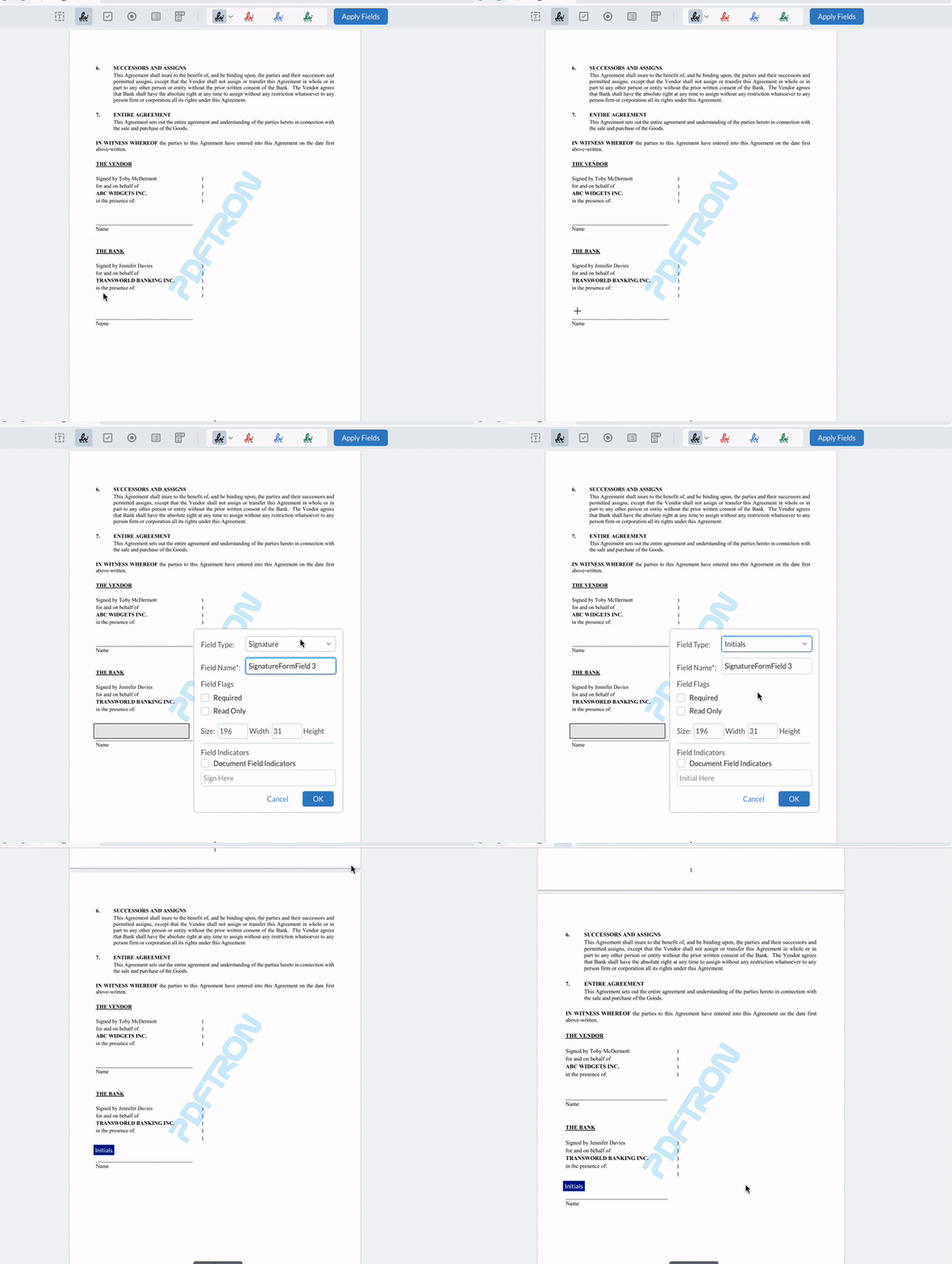
Starting in WebViewer 8.9, signature fields can be created to accept signatures or initials. Simply choose the required option in the dropdown. Please note that the initials feature must be enabled in order for this option to be displayed. For a sample on how to do this refer to this guide.
Signature widgets that are flagged as requiring initials will apply initials created by the user in the signature modal during the signing process.
Radio Fields
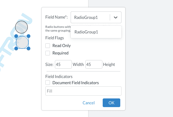
In order to logically group radio buttons together, ensure that they all share the same field name.
Check Box Field
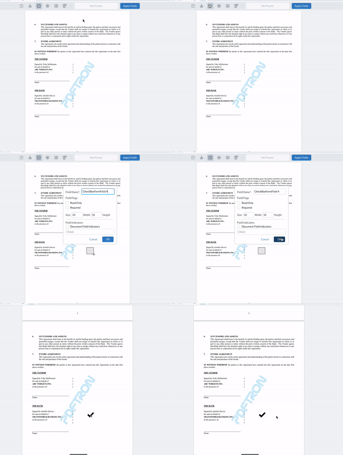
Check boxes support two field flags: required and read only.
List and Combo Box Fields
For list and combo box fields you can add as many options as you wish, and re-order them as needed. List box fields also have support for multiselection if this flag is enabled,

Did you find this helpful?
Trial setup questions?
Ask experts on DiscordNeed other help?
Contact SupportPricing or product questions?
Contact Sales