Some test text!

Search
Hamburger Icon

Web / Guides / Custom selection model

Custom selection model

The annotation selection handles and outlines are drawn with HTML Canvas APIs and by customizing the ControlHandle and SelectionModel classes, and utilizing Canvas APIs, it is possible to create a custom selection model.

Creating the custom selection handles

The selection handles are rendered in the ControlHandle class, and by overriding some of the static properties and the draw method, you can create custom handles. The static properties can be used to change the width, height, and color of the handle. The draw function will give total control draw the selection handles as you like.

WebViewer(
  // ...
).then(function(instance) {
  const { Annotations } = instance.Core;
  const { SelectionModel, Color, ControlHandle } = Annotations;

  ControlHandle.outlineColor = new Color(255, 99, 71);
  ControlHandle.color = new Color(255, 99, 71);
  // Defines the width of all control handles. Default is 10.
  ControlHandle.handleWidth = 15;
  // Defines the height of all control handles. Default is 10.
  ControlHandle.handleHeight = 15;

  ControlHandle.prototype.draw = function(ctx, annotation, selectionBox, zoom) {
    if (typeof zoom === 'undefined') {
      zoom = 1;
    }

    ctx.strokeStyle = ControlHandle.outlineColor.toString();
    ctx.fillStyle = ControlHandle.color.toString();
    ctx.shadowColor = ControlHandle.shadowColor.toString();
    ctx.shadowBlur = ControlHandle.shadowBlur;
    ctx.shadowOffsetY  = ControlHandle.shadowOffsetY;
    ctx.lineWidth = ControlHandle.selectionPointOutlineThickness / zoom;

    const dim = this.getDimensions(annotation, selectionBox, zoom);
    const x = dim.x1;
    const y = dim.y1;
    const width = dim.getWidth();
    const height = dim.getHeight();

    ctx.beginPath();
    ctx.rect(x + 10 / 2, y + 10 / 2, 10, 10);
    ctx.stroke();
    ctx.fill();
  };
});
defaul-selection-model
custom-selection-handle
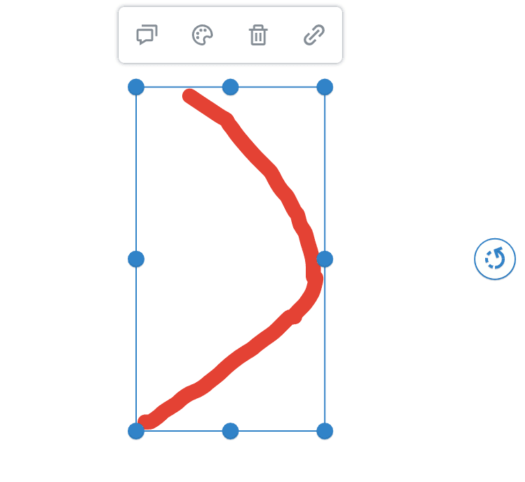
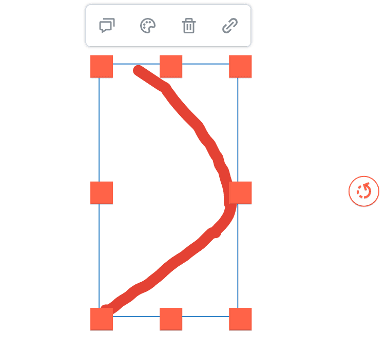
Figure 1. On the left side is the default selection handles and on the right side are custom selection hendles.

Creating the custom selection outlines

The selection outlines can be customized with the SelectionModel class. For changing width, height, and color, use static properties as shown in the code sample. The drawSelectionOutline can be overridden to access the canvas context and draw the outlines differently.

WebViewer(
  // ...
).then(function(instance) {
  const { Annotations } = instance.Core;
  const { SelectionModel, Color } = Annotations;

  SelectionModel.selectionOutlineThickness = 5;
  // Defines a padding for selection accuracy. Default is 2.
  // Increase this value to make selection more forgiving.
  SelectionModel.selectionOutlineThickness = 5;
  // Defines the default color for the annotation selection outline.
  SelectionModel.defaultSelectionOutlineColor = new Color(23, 23, 23);
  // Defines the default color for the annotation selection outline when the user is not permitted to make modifications.
  SelectionModel.defaultNoPermissionSelectionOutlineColor = new Color(23, 23, 23);
  // Defines the dash size for the selection outline. Default is 4;
  SelectionModel.selectionOutlineDashSize = 8;

  SelectionModel.prototype.drawSelectionOutline = function(ctx, annotation, zoom, pageMatrix) {
    if (typeof zoom !== 'undefined') {
      ctx.lineWidth = SelectionModel.selectionOutlineThickness / zoom;
    } else {
      ctx.lineWidth = SelectionModel.selectionOutlineThickness;
    }

    // changes the selection outline color if the user doesn't have permission to modify this annotation
    if (this.canModify()) {
      ctx.strokeStyle = SelectionModel.defaultSelectionOutlineColor.toString();
    } else {
      ctx.strokeStyle = SelectionModel.defaultNoPermissionSelectionOutlineColor.toString();
    }

    // modify this part
    ctx.beginPath();
    ctx.moveTo(annotation.X, annotation.Y);
    ctx.lineTo(annotation.X + annotation.Width, annotation.Y + annotation.Height);
    ctx.closePath();
    ctx.stroke();

    const dashUnit = SelectionModel.selectionOutlineDashSize / zoom;
    const sequence = [dashUnit, dashUnit];
    ctx.setLineDash(sequence);
    ctx.strokeStyle = 'rgb(255, 255, 255)';
    ctx.stroke();
  };

});
defaul-selection-model
custom-selection-outline
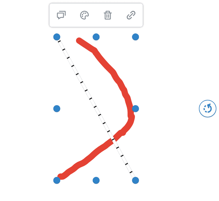
Figure 2. On the left side is the default selection outlines and on the right side are custom selection outlines.

Get the answers you need: Chat with us